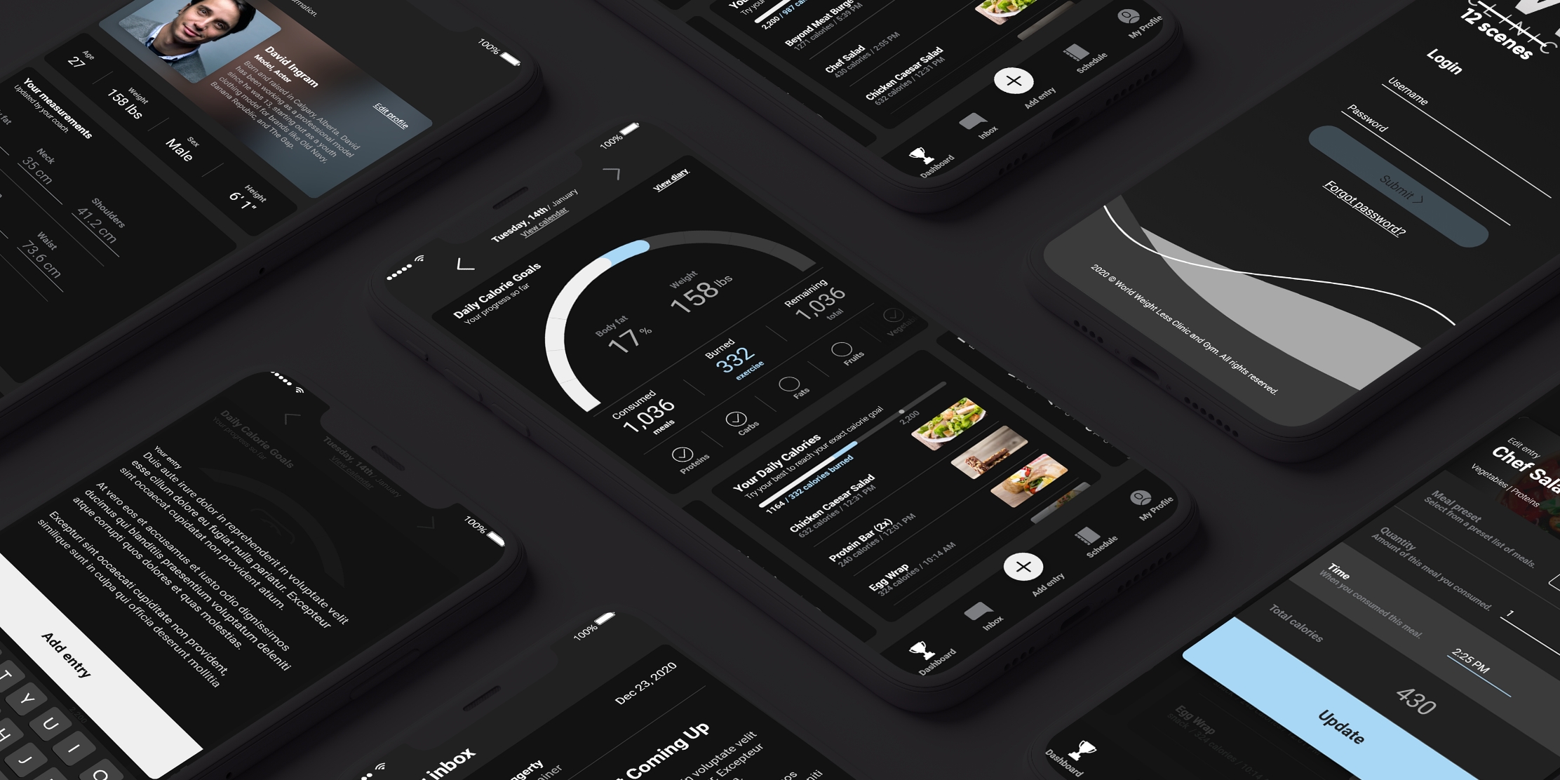
I was the main visual designer assigned to a mobile app project for World Weight Loss. I designed and delivered a comprehensive UX plan and professionally designed artboards for the major screens & user flows.
The primary goal of the app was to deliver a seamless fitness and diet tracking experience, made more complex by the frequent and lengthy logging requirements outlined in the project scope.
The app was designed for actors and models under strict contractual wellness requirements. I started by deeply understanding their needs—what types of routines they followed, where current tools fell short, and how their day-to-day could be better supported. This foundation was critical in shaping realistic and high-value user journeys.
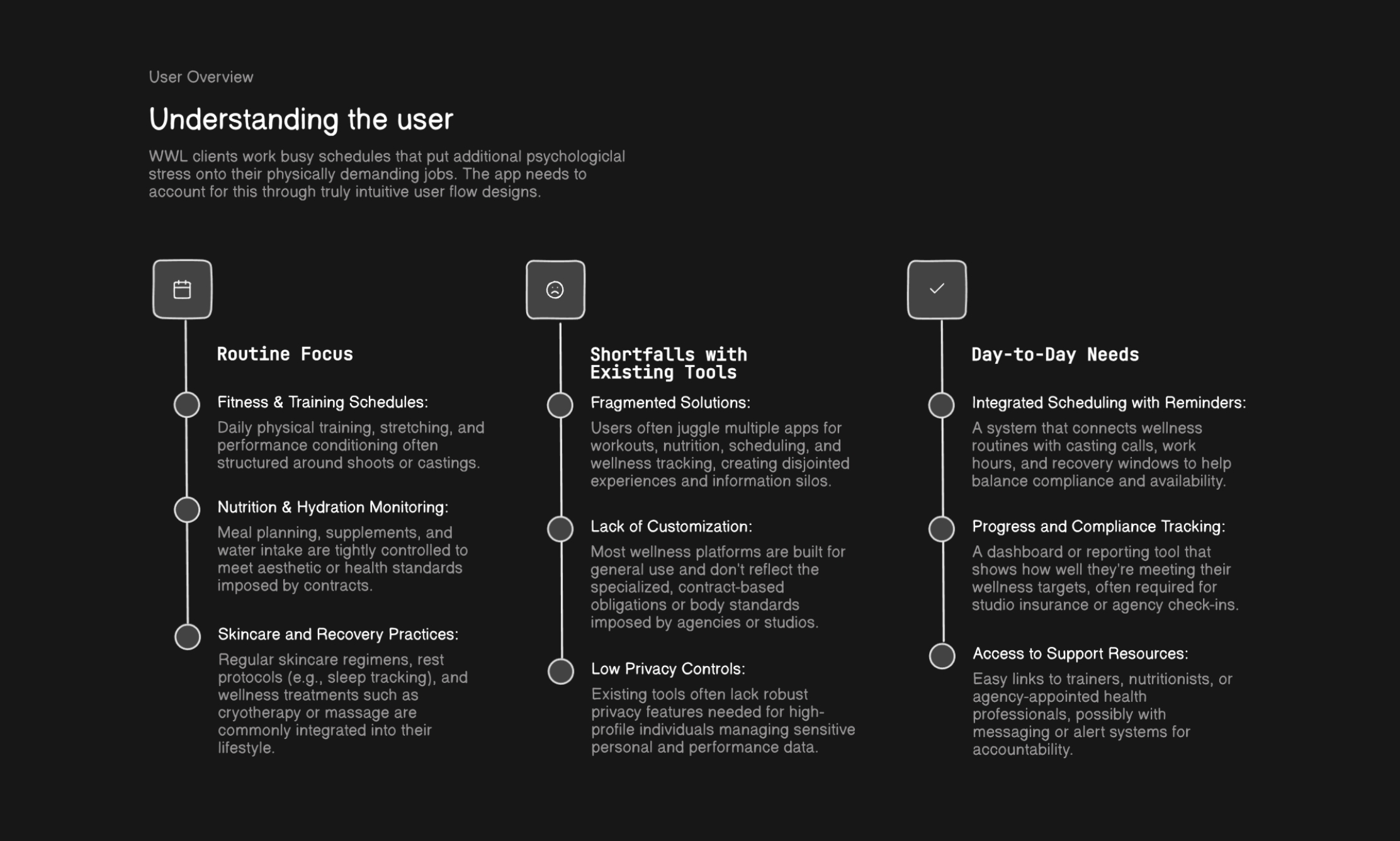
I used my time with the client to understand the needs of their users, creating an increasingly detailed profile that would guide our design decisions later on.
Many users were accustomed to logging health data via spreadsheets or desktop tools, which didn't translate well to mobile. Working with the dev team, I helped concept an auto-response system that learned from user behavior and reduced friction. The result was a smarter, more responsive app experience that made logging effortless and improved personalization.
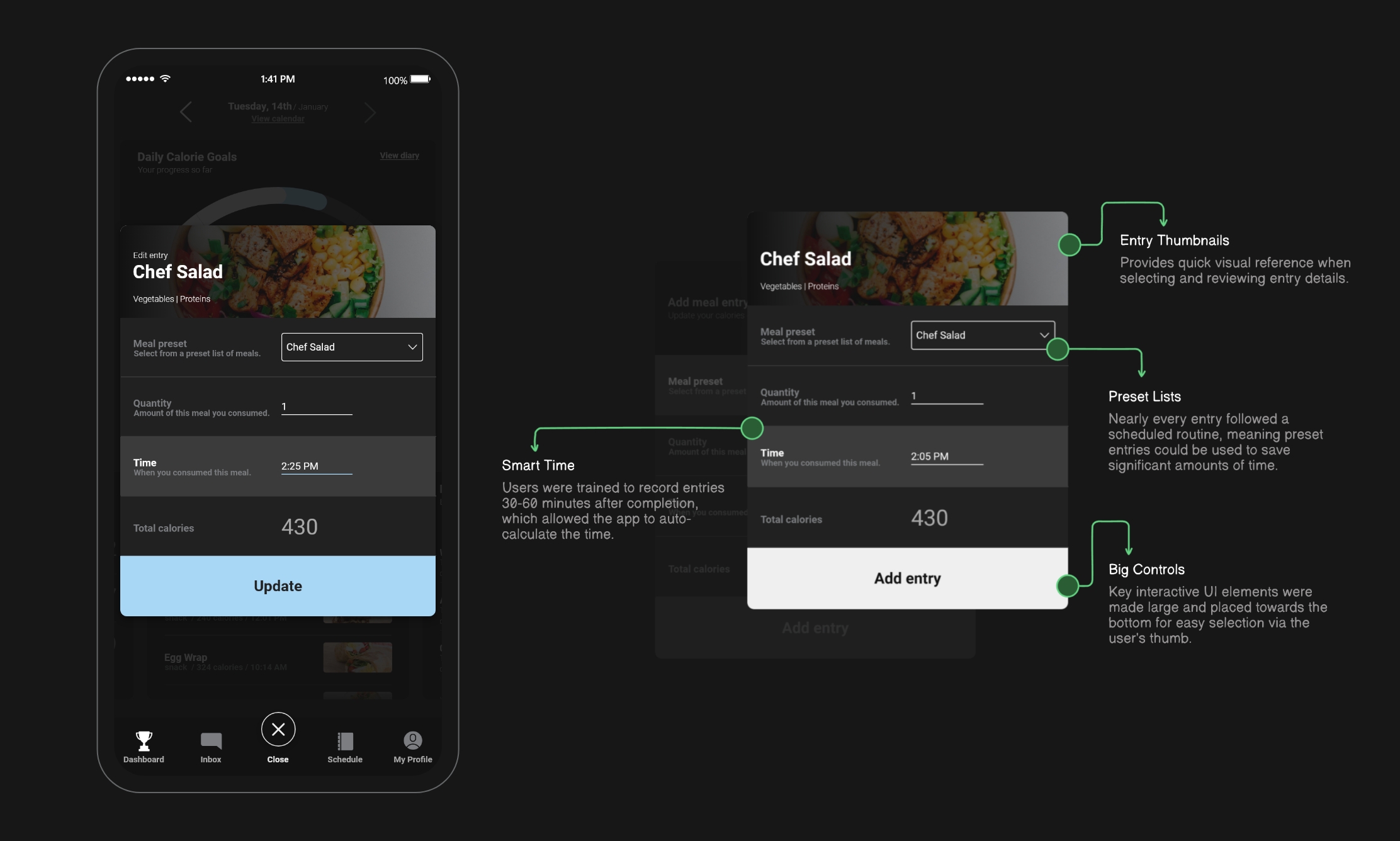
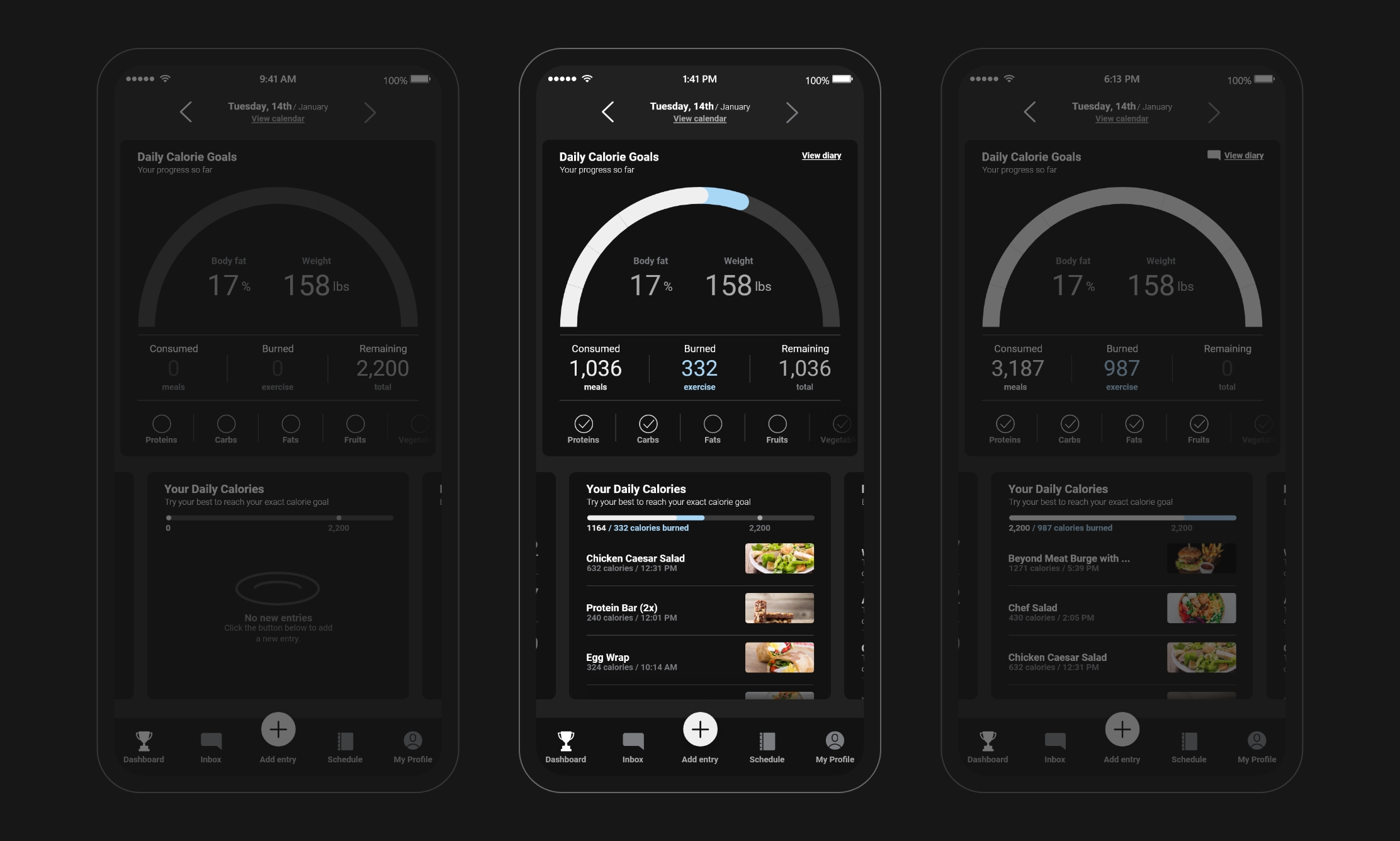
The auto-reponse system leveraged functionality like presets to make user entry tasks more automated, while still requiring the user to review their submissions.
To guide our design decisions, I evaluated a range of health and fitness apps. I tracked observations across UI patterns, friction points, and feature sets, compiling feedback from my team into a structured list of design takeaways. This informed a more deliberate product strategy that avoided common missteps and highlighted key opportunities for innovation.

I frequently consulted my research and analysis of the project requirements when creating the visual system users would engage with throughout the entire app experience.
Using our research, I mapped out full user journey flows and wireframes—detailing how users navigate the app from login to completion of goals. These wireframes made our direction tangible for both the client and dev team, facilitating alignment and helping surface usability improvements early on in the process.
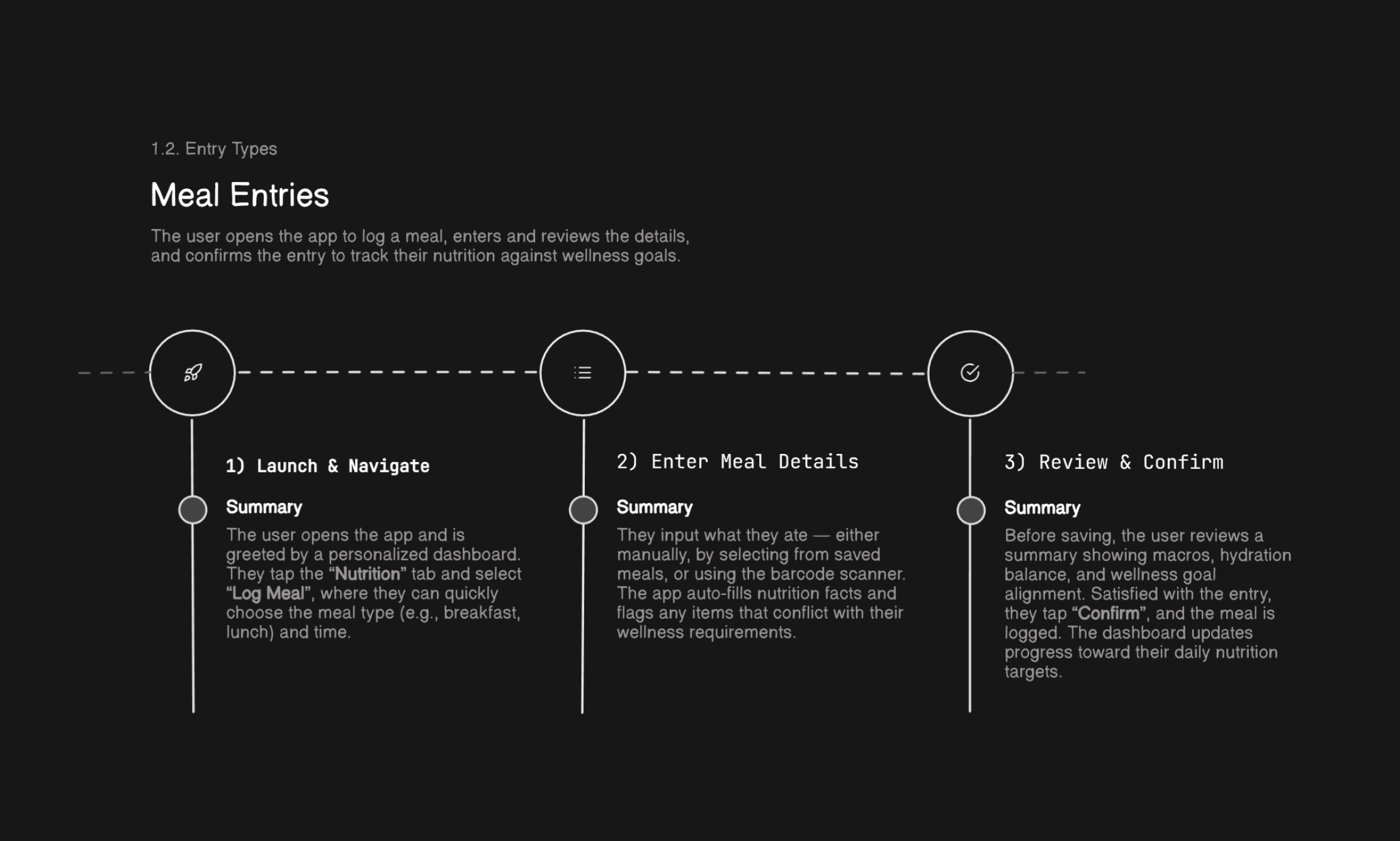
User journey mapping helped understand and identify the needed functionality across all key screens.
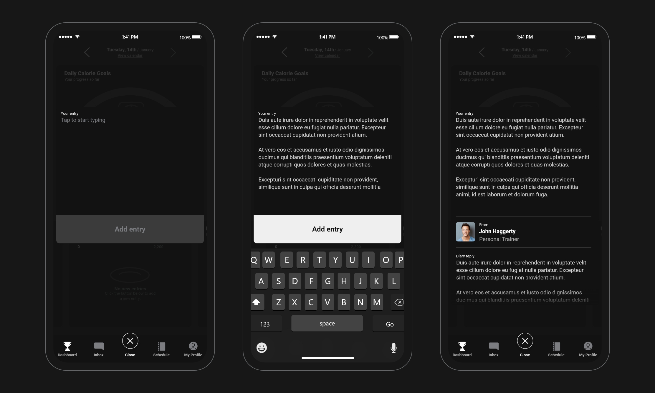
Another key functionality involved being able to add diary entries that could be shared with coaches and other supporting staff.
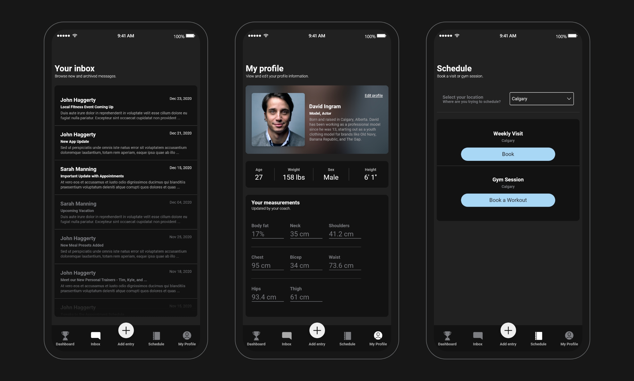
The app would feature supporting areas as part of the client's business and user goals, such as a messaging system and the ability to book appointments.
I translated the final wireframes into polished mobile artboards, building a clean and functional interface that prioritized usability and motivation. These designs were used for internal prototyping and iterated based on regular client feedback. The final designs were handed off to developers as a high-fidelity package ready for implementation.