Sharely was a personal design and development project, creating a free-form content management system for users to share & organize content however they need. It resembled a combination of Google Drive and Notion, allowing for the organization of data across the platform while enabling free-form functionality for user freedom.
The concept of Sharely came from a feeling of frustration, often having to navigate highly complex suites of interconnected apps.
Working across multiple teams, I noticed how common it was for professionals to juggle a complex web of services—spreadsheets, file drives, project tools, wikis, and dashboards—all at once. This led to friction, redundancy, and wasted time. This realization became the catalyst for the Sharely concept: a platform that unifies tools without compromising flexibility or professionalism.
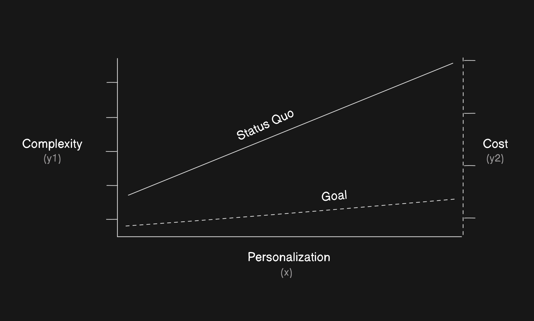
The underlying goal of this project was to explore a possible solution that reduced both complexity and cost while maintaining a high degree of personalization for users.
To ground the solution in real needs, I began with a series of ‘how might we’ prompts focused on reducing cognitive load and improving cross-functional transparency. From there, I explored ideas around modular content blocks, customizable views, and a dynamic structure that adapted to different users’ needs. This phase emphasized open-ended ideation, reframing problems rather than jumping into solutions.
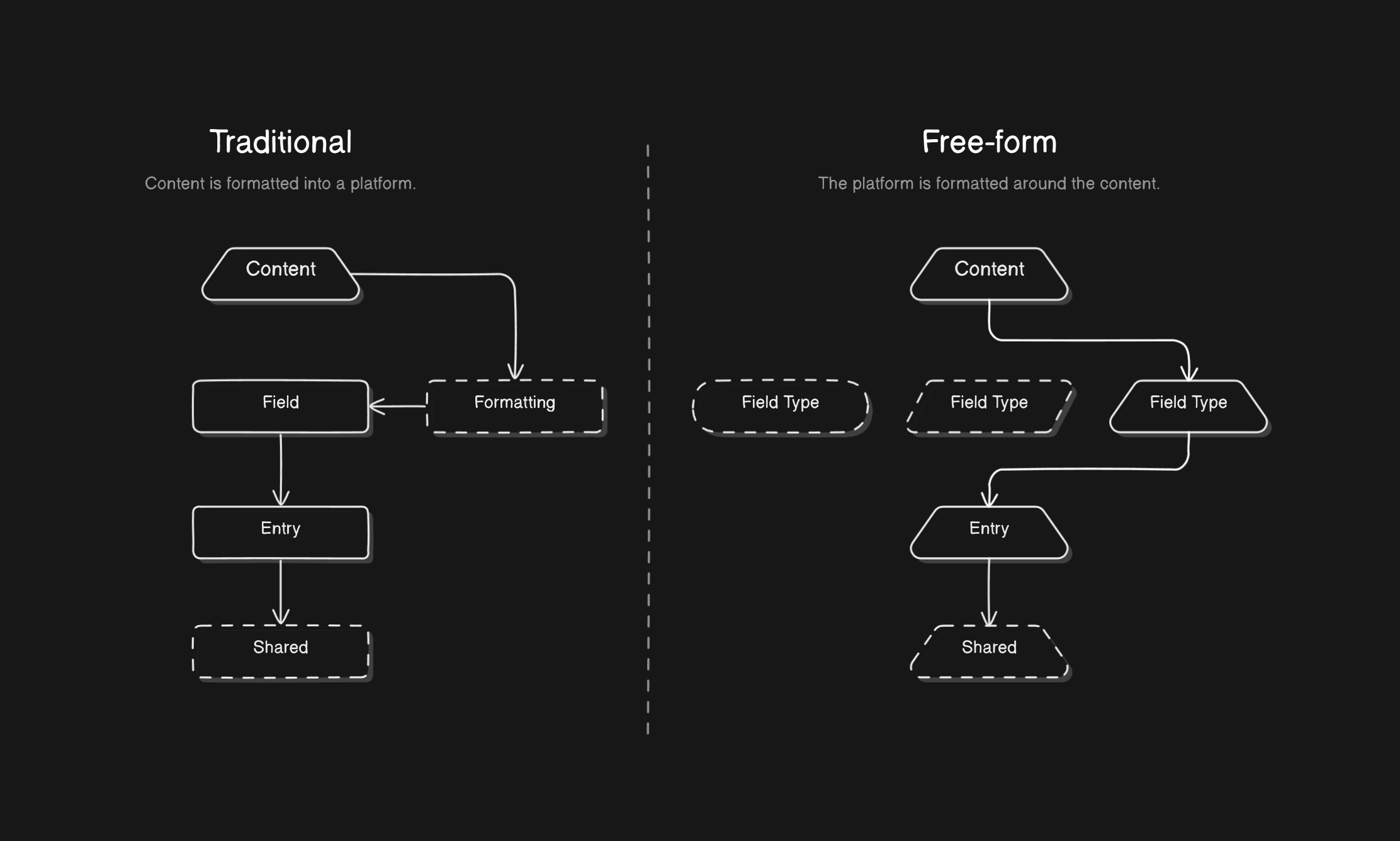
A free-form approach to content management, such as what Notion provides, would be key in maintaining the customization users need for the solution to be valuable.
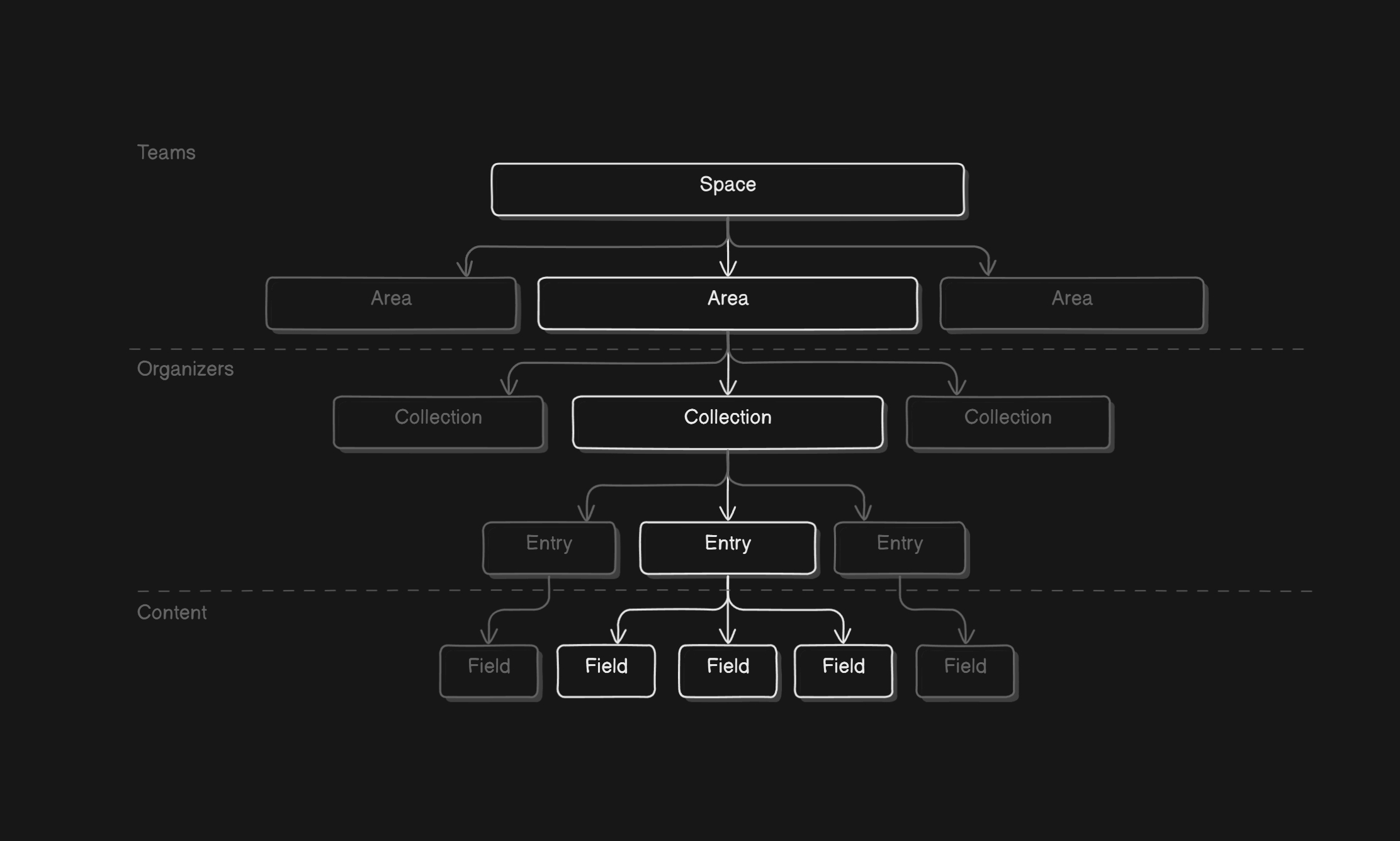
Some early planning involved designing the information architecture that users would need to manage all of their content in one place.
I created journey maps to visualize how users might engage with the platform—from collecting resources, to organizing data, to publishing finished content. These maps helped define user roles, touchpoints, and friction areas. By simulating real-world workflows, I was able to clarify what features the platform should prioritize and where customization would be most valuable.
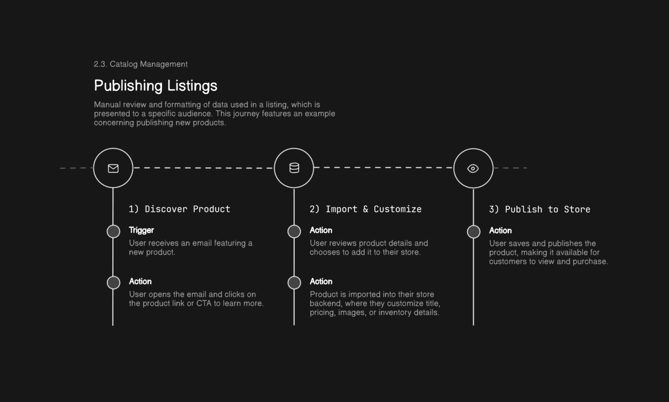
I created example user journeys to map out and understand what features would be required for key, essential actions.
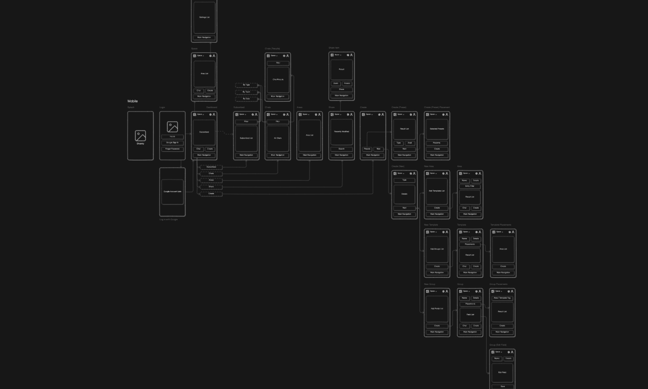
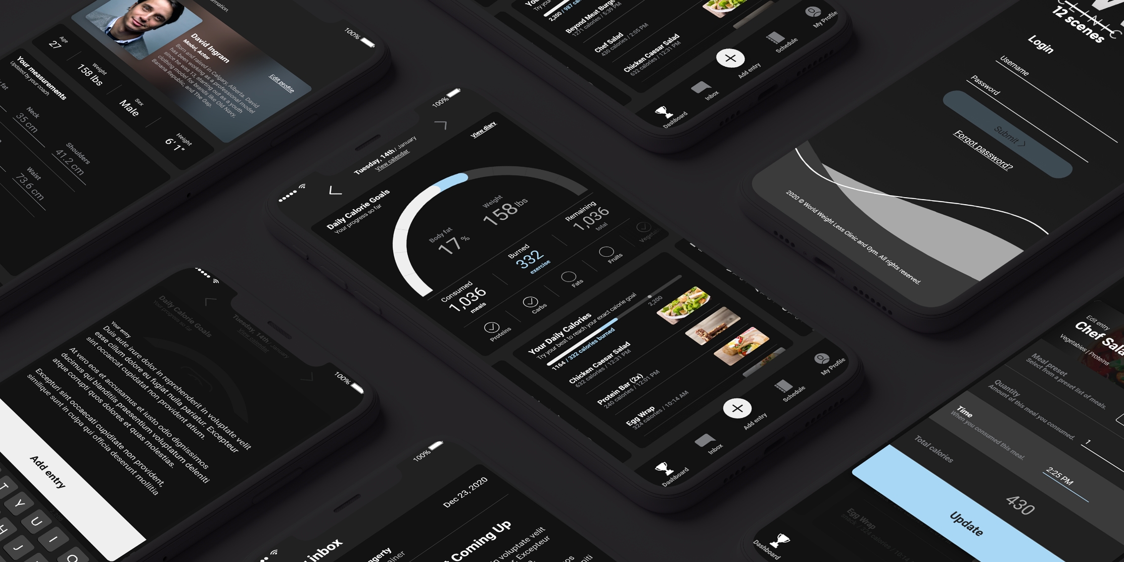
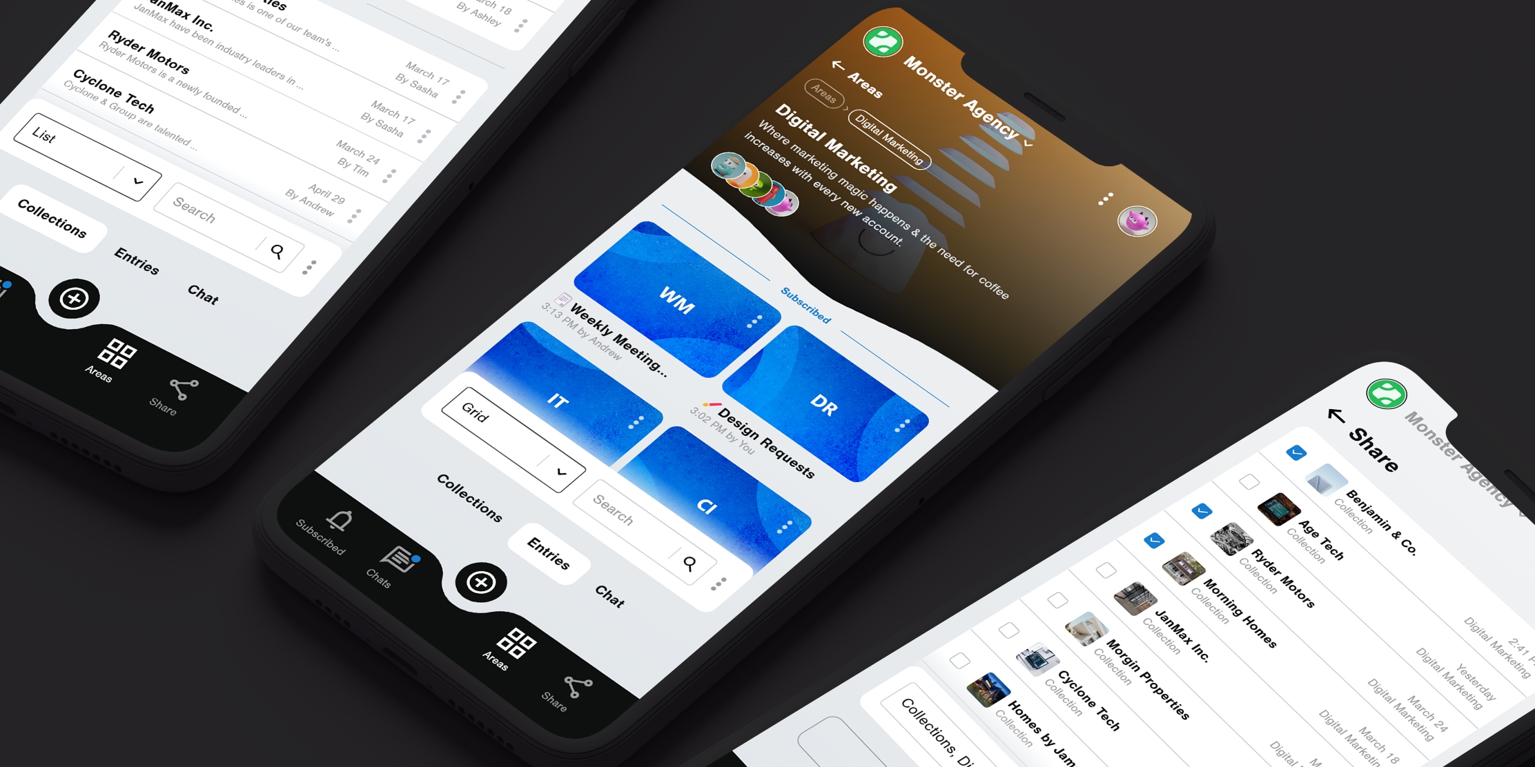
Having a direction on what I wanted the experience to be, I created mobile wireframes that would guide the creation of more polished artboards later on.
The UI had to support two extremes: rigid structure for power users, and total creative freedom for flexible thinkers. I designed a visual system using draggable components, resizable grids, collapsible sections, and templating options. Each screen was crafted to feel intuitive but adaptable—users could create anything from a database to a polished client portal without switching platforms.

The primary presentation experience involved mapping content to an entry, creating a unique or template design, then previewing what an audience would see.
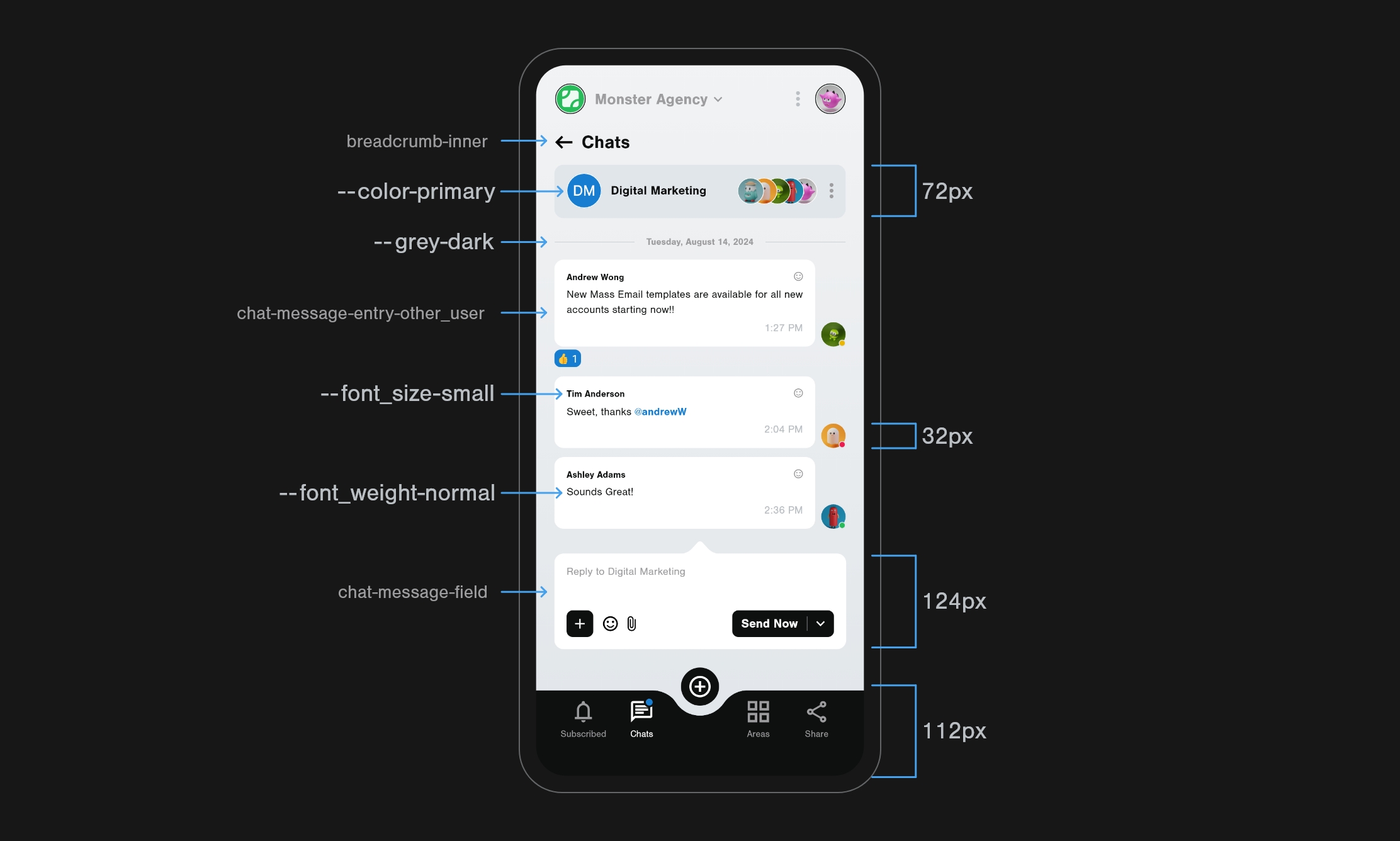
To manage the scale and growth of the UI, I created a easy-to-follow visual design system.
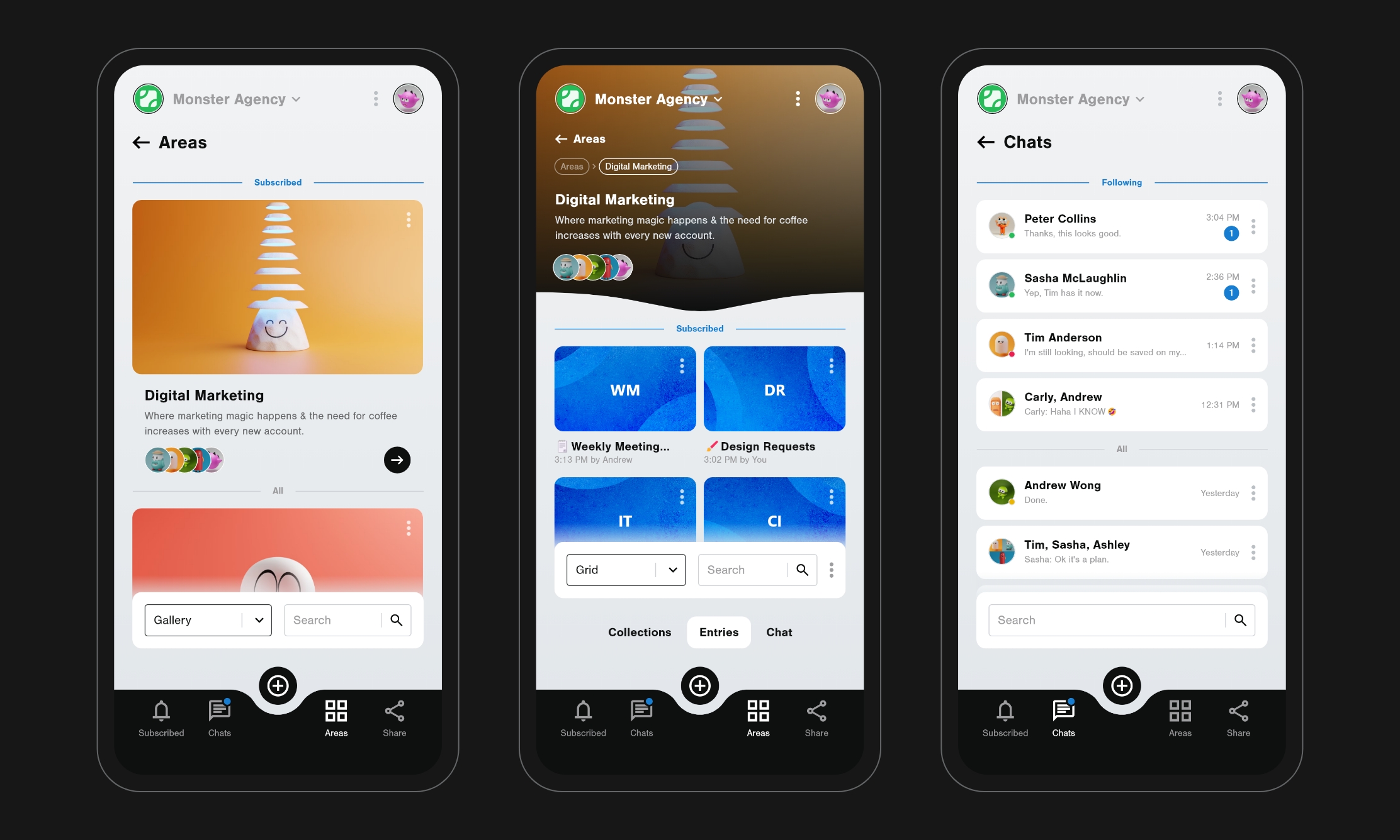
I didn't want to reinvent the wheel with spaces. Users can create areas that they can delegate access to, then use that space for organizing conversations and discussions.
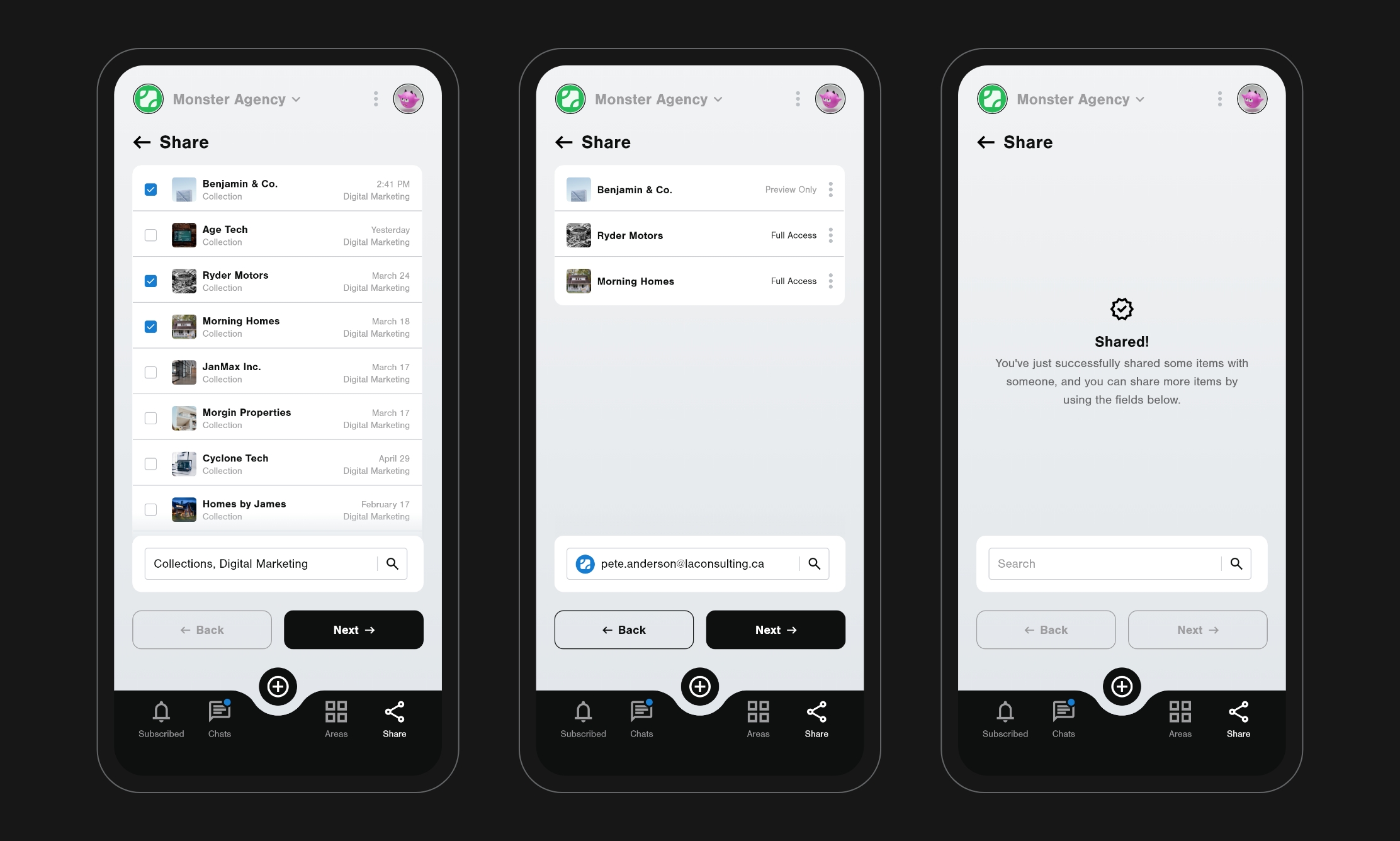
Users determine what information is accessible in entries that they share. This meant the same entry could be used for multiple audiences without needing to duplicate content in the system.
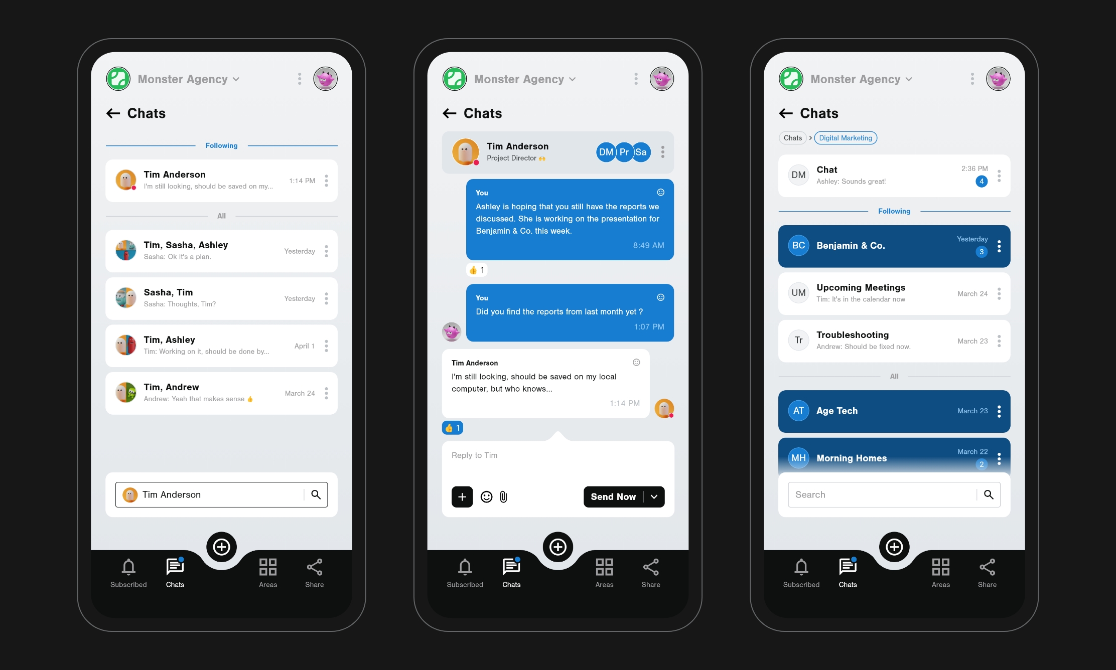
Chats are often the 'glue' for keeping teams connected, and I wanted to ensure this experience would be similar to most other platforms—both in presentation and functionality.
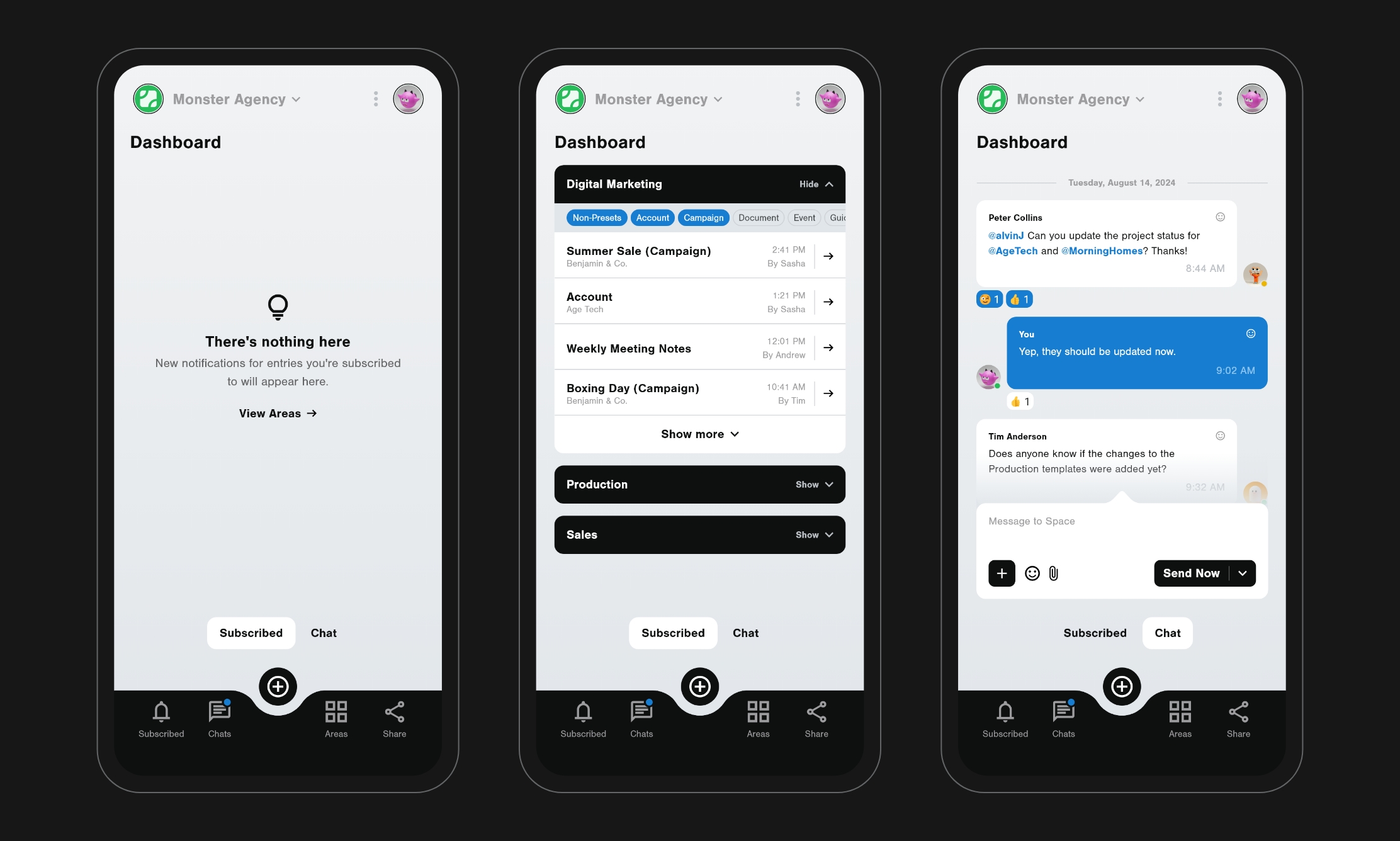
Users can subscribe to what they're interested in, which then composes the dashboard. This led to a more personalized dashboard, helping users jump into their daily interests quickly.
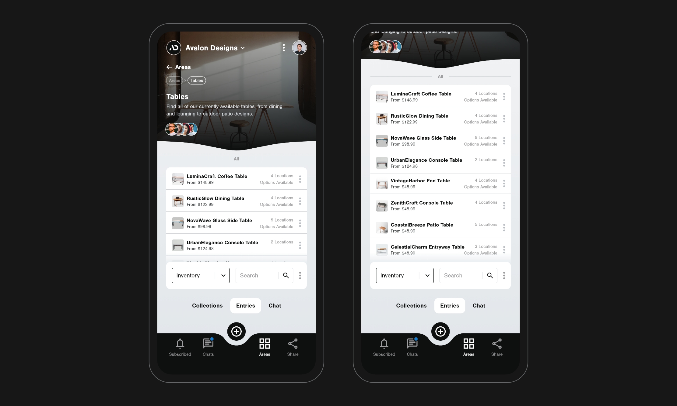
Sharely could be used for managing store inventory then sharing what's available with customers.
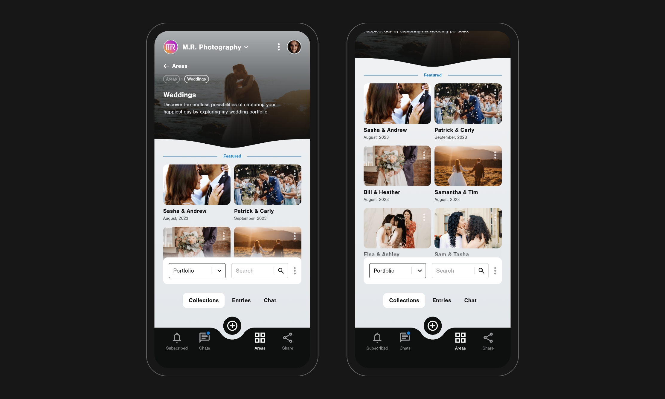
Another practical use case would be for organizing and displaying portfolio pieces, such as a photography collection.
Sharely wasn’t just a concept—it became a space for me to practice high-level UX planning, information architecture, and visual design thinking. It expanded my toolkit and gave me a clearer framework for approaching complex product ideas. The result was more than a prototype—it was a system for thinking, designing, and building better digital experiences.