I worked with a company launching their website builder CMS platform (ShoutCMS) as the lead brand designer. I created a new, comprehensive brand identity package that saw the platform launch to great reception.
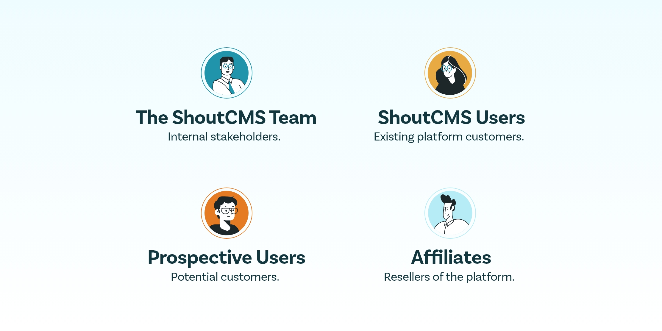
Identifying and understanding brand stakeholders is always one of the first objectives I set for brand development projects.
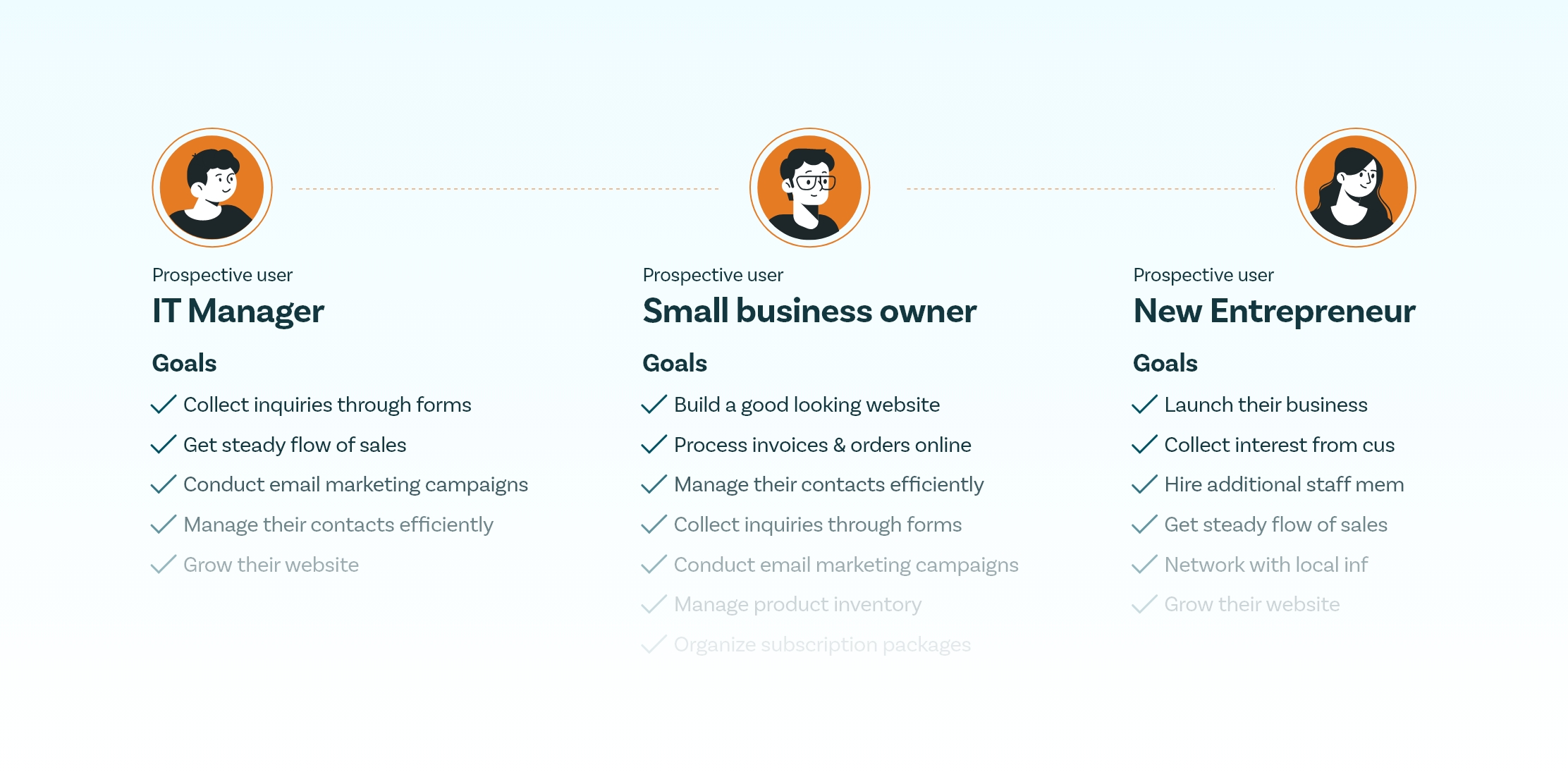
Before diving into visuals, I worked with the ShoutCMS team to define brand goals. This included clarifying the primary audience—small to mid-sized business owners—and articulating what the brand should communicate: trust, utility, and innovation. These early sessions helped the entire team rally around a clear direction and business-aligned creative vision.
Diving into stakeholder segments helps determine the direction a brand needs to take in order to maximize its relevancy across audiences.
Through competitor analysis and market research, we discovered that business owners were drawn to platforms with bold, youthful branding and a business-first feature set. This insight shifted our strategy away from overly polished design trends, and toward a more accessible, confident tone—appealing to modern entrepreneurs rather than traditional developers or designers.
Use of creative diagrams and presentations helps highlight key brand values, such as the belief that ShoutCMS 'helps entrepreneurs on their business journey.'
One of the biggest challenges was ensuring internal alignment across a large stakeholder group. I created a structured brand brief that evolved over time, capturing team input while maintaining forward momentum. This helped turn differing opinions into shared direction, streamlining the creative process and making everyone feel invested in the outcome.
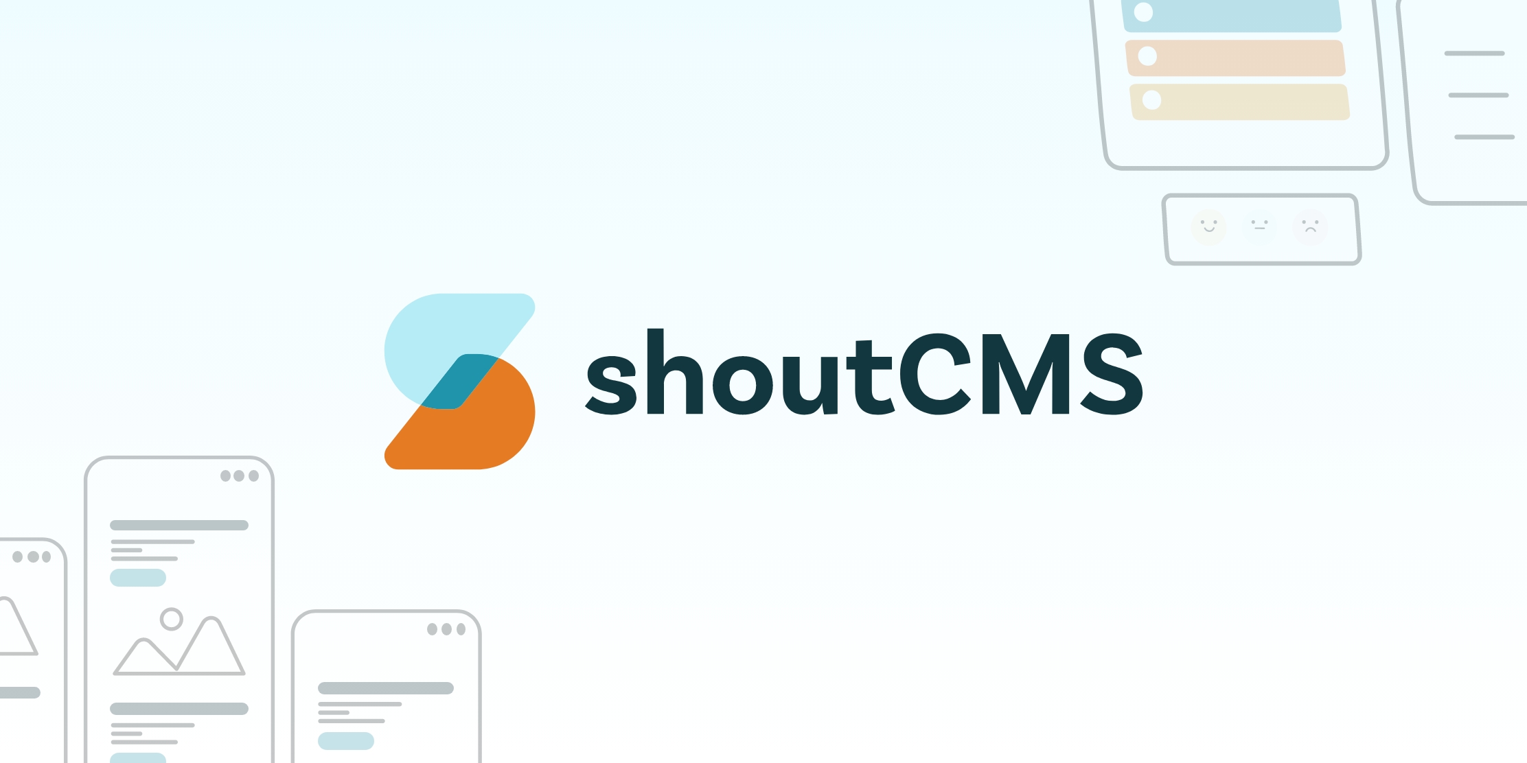
The logo design saw inspiration from all comparable platforms, merging customer expectations with the innovative ambitions of the ShoutCMS team.
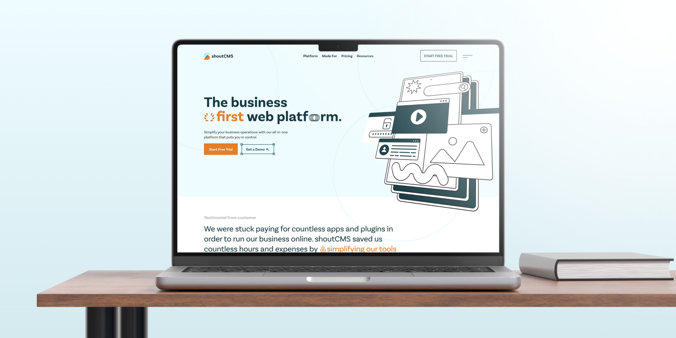
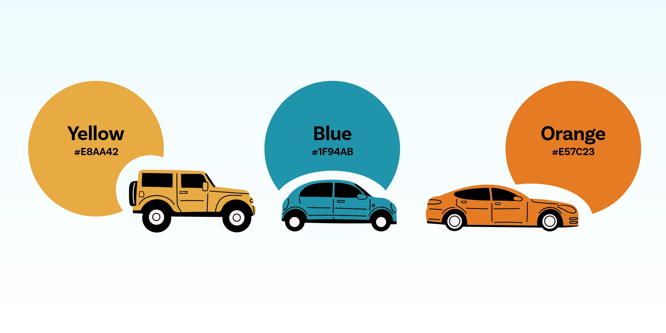
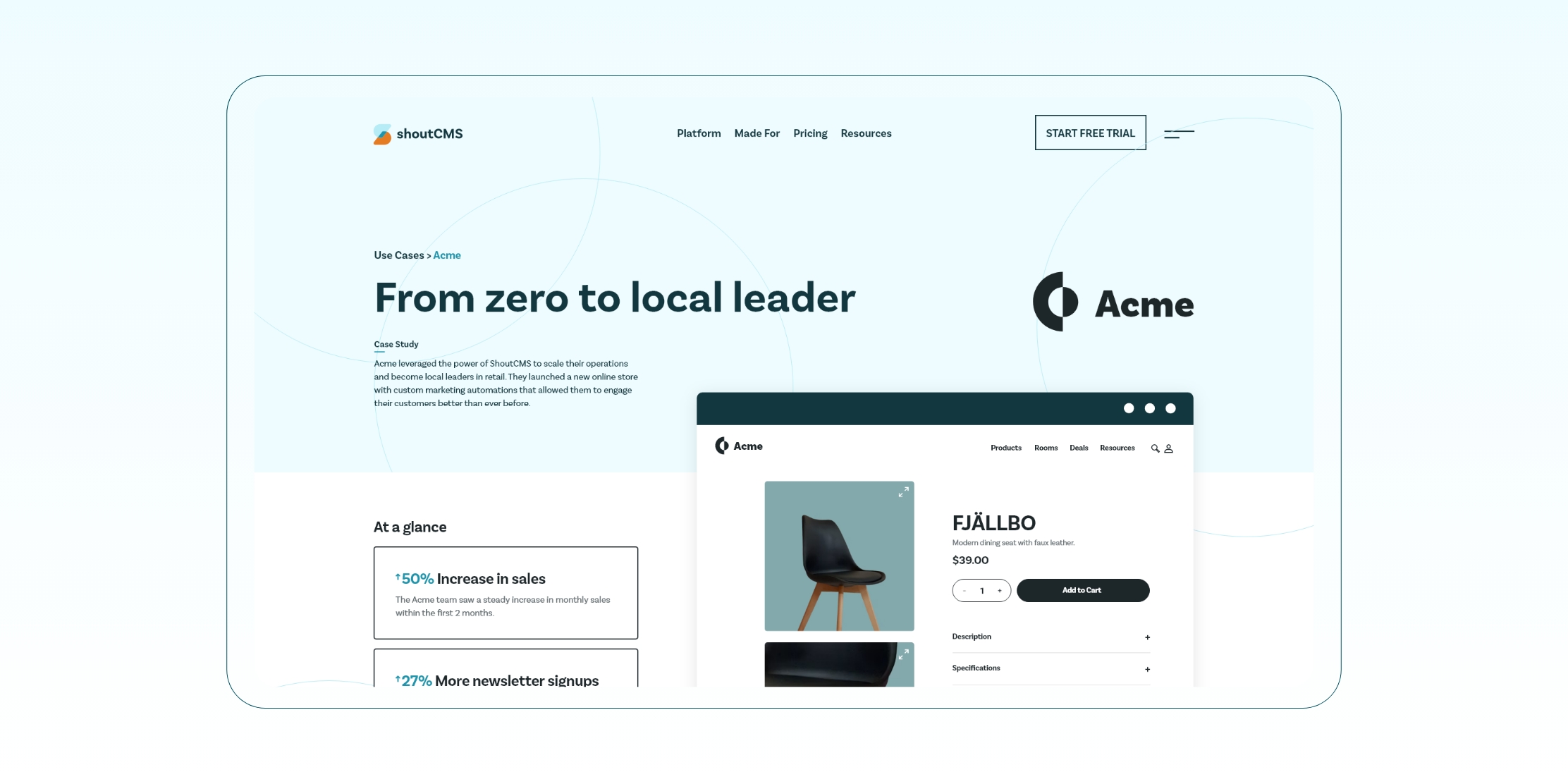
With clear goals and market insights in place, I designed a full visual identity: logo, color system, typography, brand guidelines, and web direction. The result was a professional yet friendly identity that reflected the platform’s core value—powerful business features delivered with simplicity. The website redesign became a central asset for their launch and sales efforts.
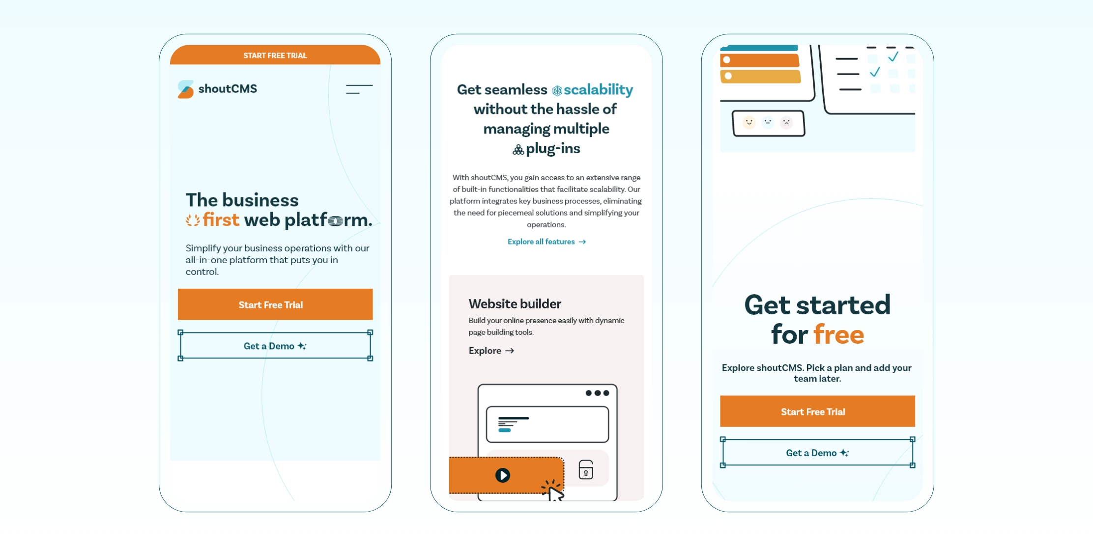
Colour contrast became a key design choice throughout each area, directing user attention to key call-to-actions that led towards the initial free trial.
The messaging transformed into playful yet professional statements that focused on the innovative nature many entrepreneurs have when scaling their business online.

One of the most important areas was the pricing page, which was very carefully designed to showcase the unique value ShoutCMS offered in a competitive market.
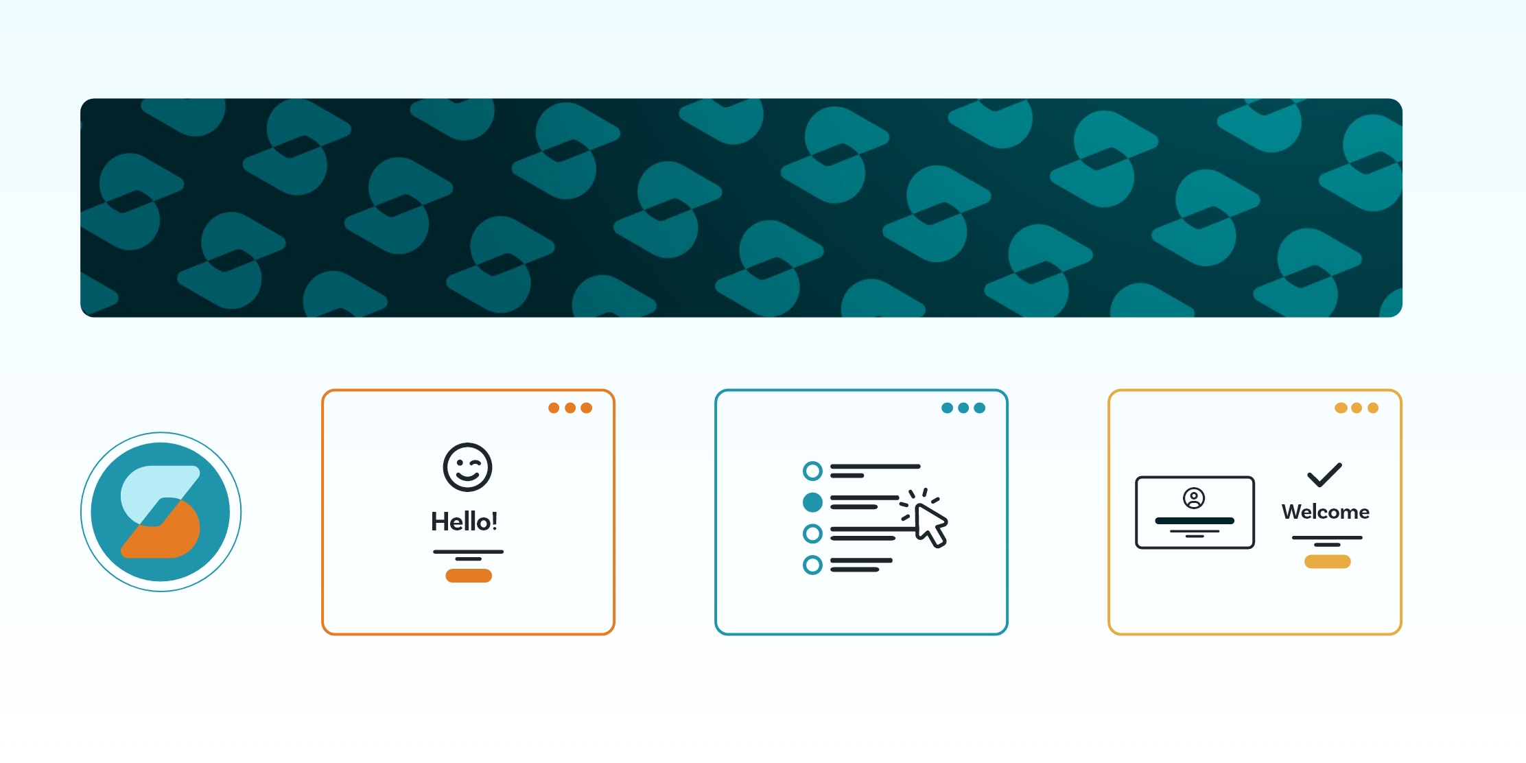
ShoutCMS required large amounts of brand collateral to be marketed across a variety of online channels, such as social post templates, graphic assets, and ad designs.
I wrapped up the project by delivering a curated brand package complete with visual guidelines, design files, and documentation. The handoff empowered the ShoutCMS team to confidently apply the brand across their launch efforts. The practical, well-documented system made it easy for developers, marketers, and leadership to stay consistent moving forward.