I led the UI/UX work for an education platform designed to help kids learn financial
literacy skills and knowledge. The platform needed to work seamlessly for both younger users, who wanted a
vibrant and interactive experience, and older users such as parents and administrators, who preferred a more
reserved and data-focused interface.
This balance between playfulness and professionalism defined the
creative challenge of the project.
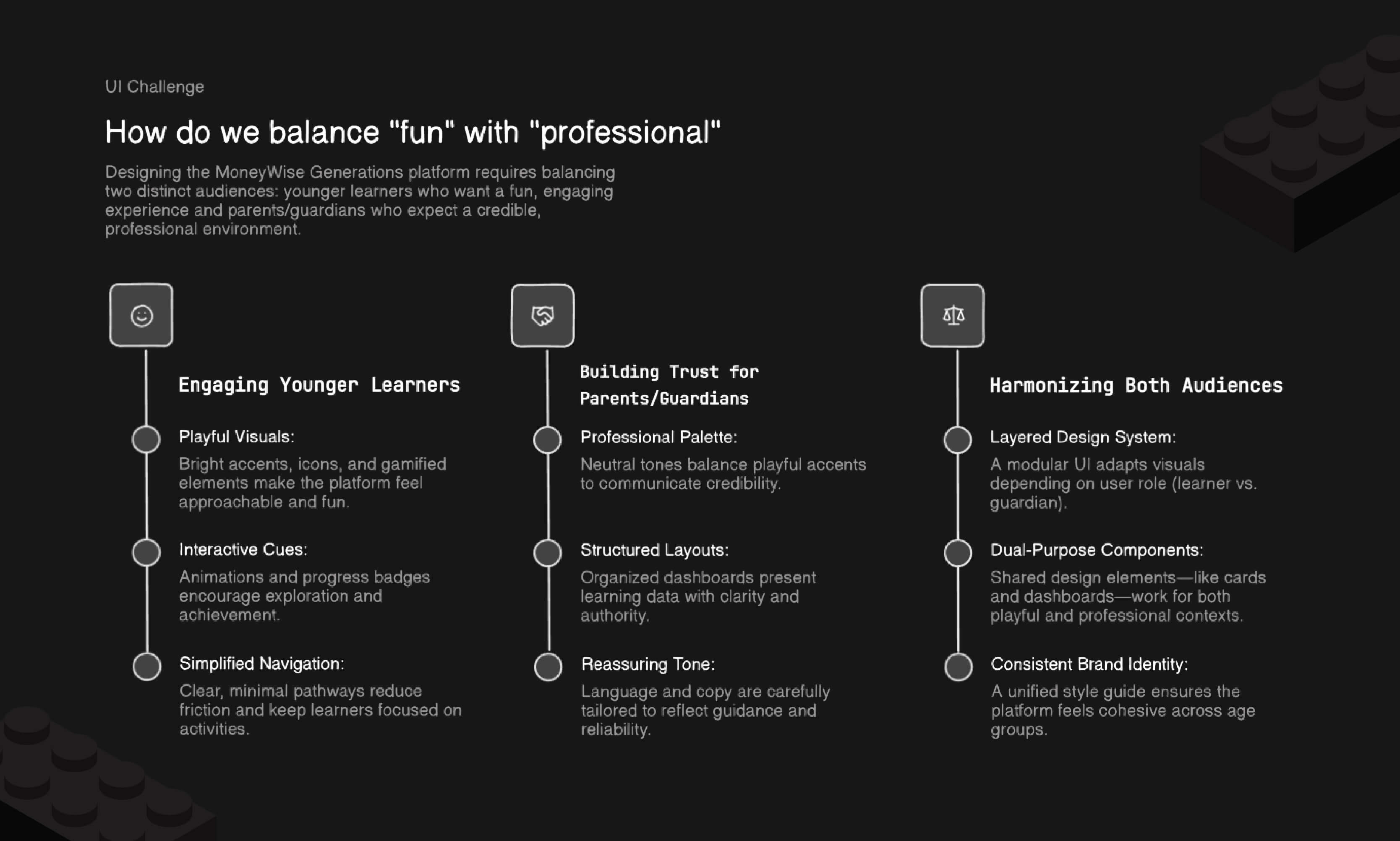
The main UI challenge I had to solve was delivering two different experiences for two different audiences in a single application.
The platform was intended to serve an unusually broad audience: children as young as
seven, teenagers, and adults including parents and administrators. I started the project by framing the
key design challenge—creating a scalable interface that felt engaging and playful for kids without
alienating adult users who valued efficiency and clarity.
This became the foundation of my role, guiding
all subsequent design decisions and research initiatives.
I began by organizing my assumptions into testable ideas that could guide the overall style of the UI.
I began by mapping hypotheses around user preferences: children might prefer more
interactivity, colour, and imagery, while adults would value minimal distractions and clearer access to
reports. With a test audience available to the project, we ran usability and affinity sessions to
validate or disprove these ideas.
The findings confirmed many of our assumptions, but also revealed
nuanced details, such as older users appreciating subtle visual cues to guide navigation rather than
stripped-down austerity.
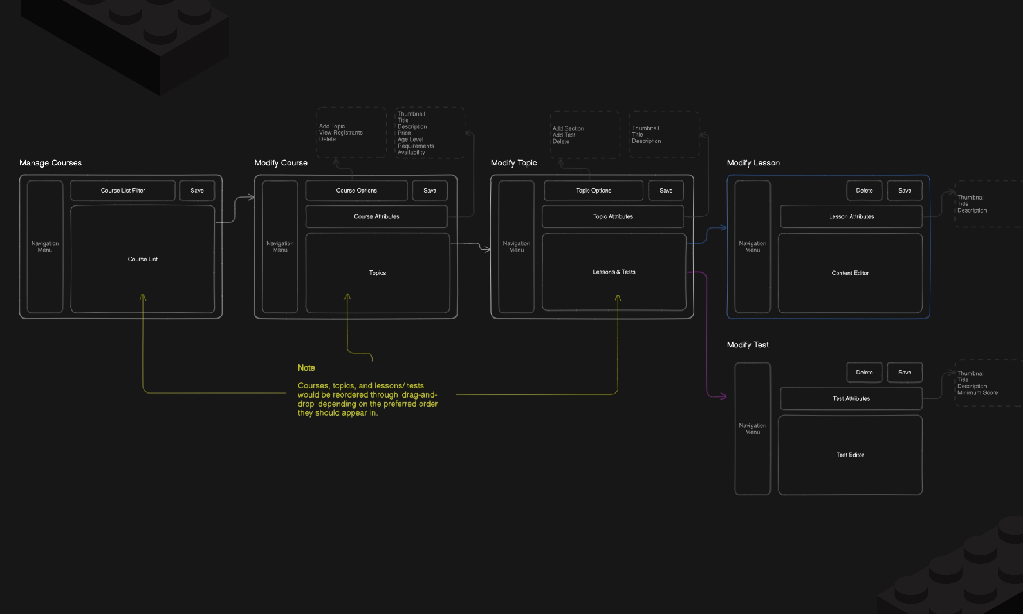
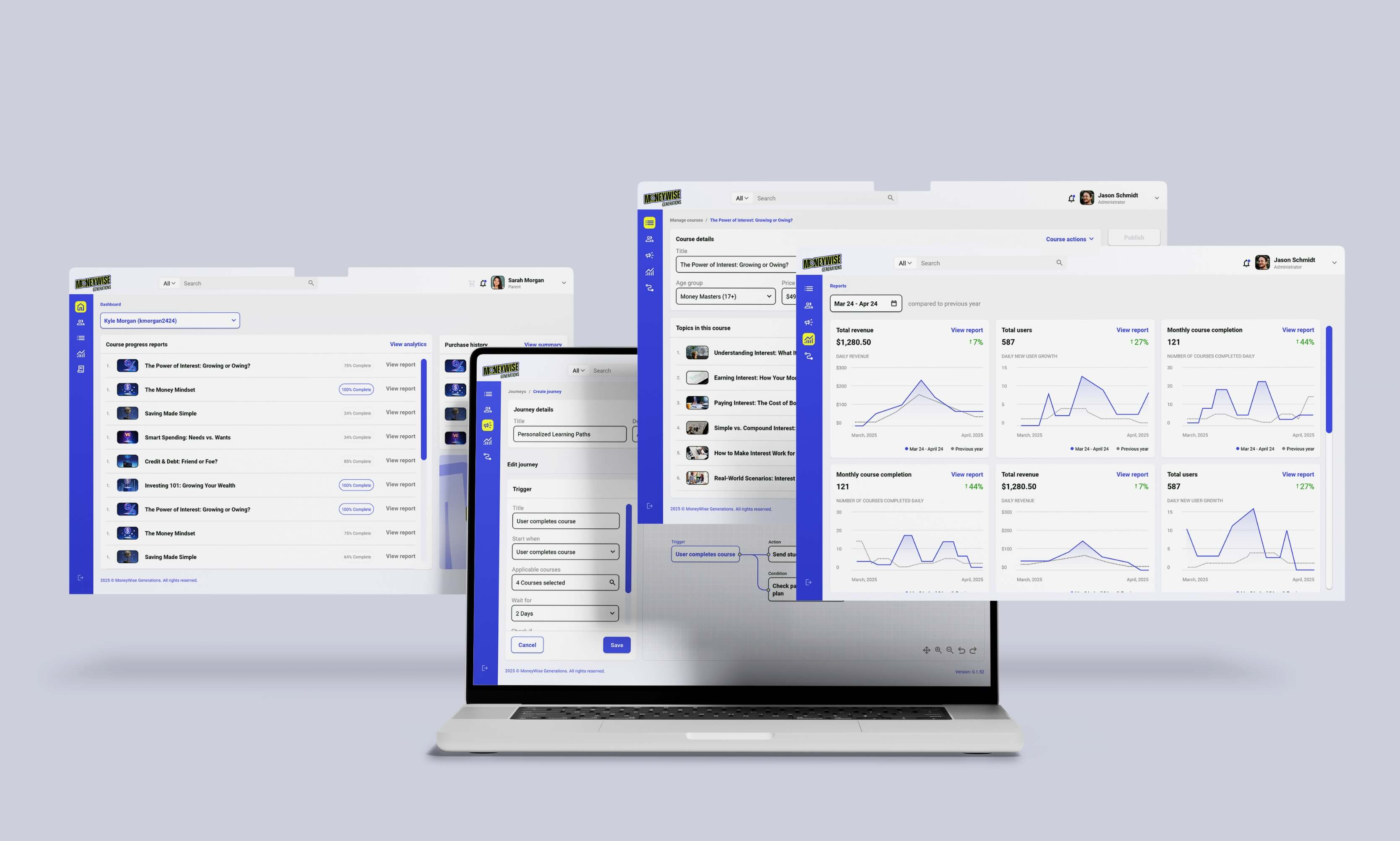
Visually mapping out the screens made it possible to fully understand the scope of components required.
After gathering insights, I mapped out key user journeys for both age groups and
documented the core platform functions. This process highlighted what components were absolutely
necessary, ensuring no redundant work would be introduced into the design or development process.
By treating this as a system-level exercise, I was able to anticipate programming needs and identify
opportunities to create reusable components that would scale across different user types and contexts.
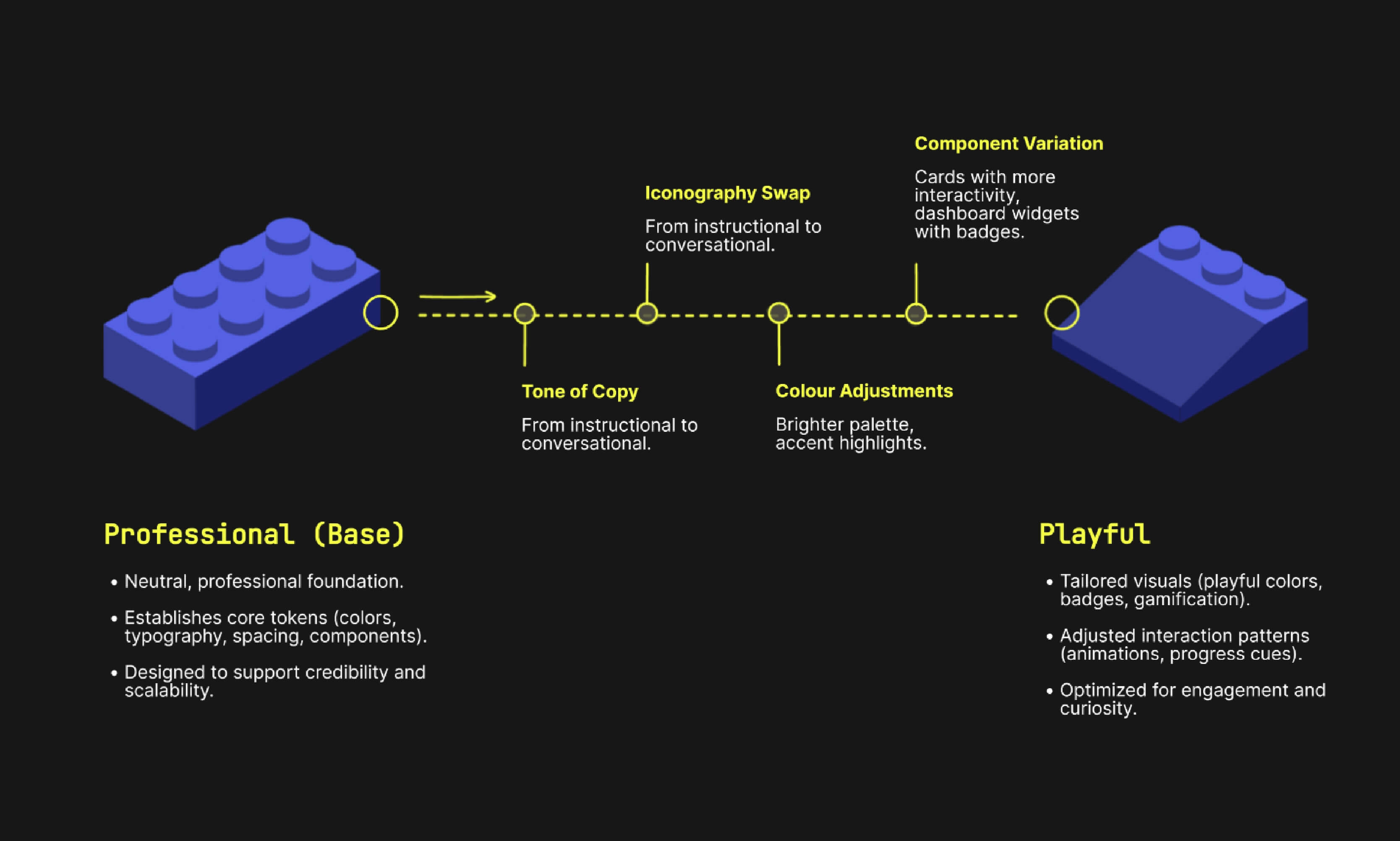
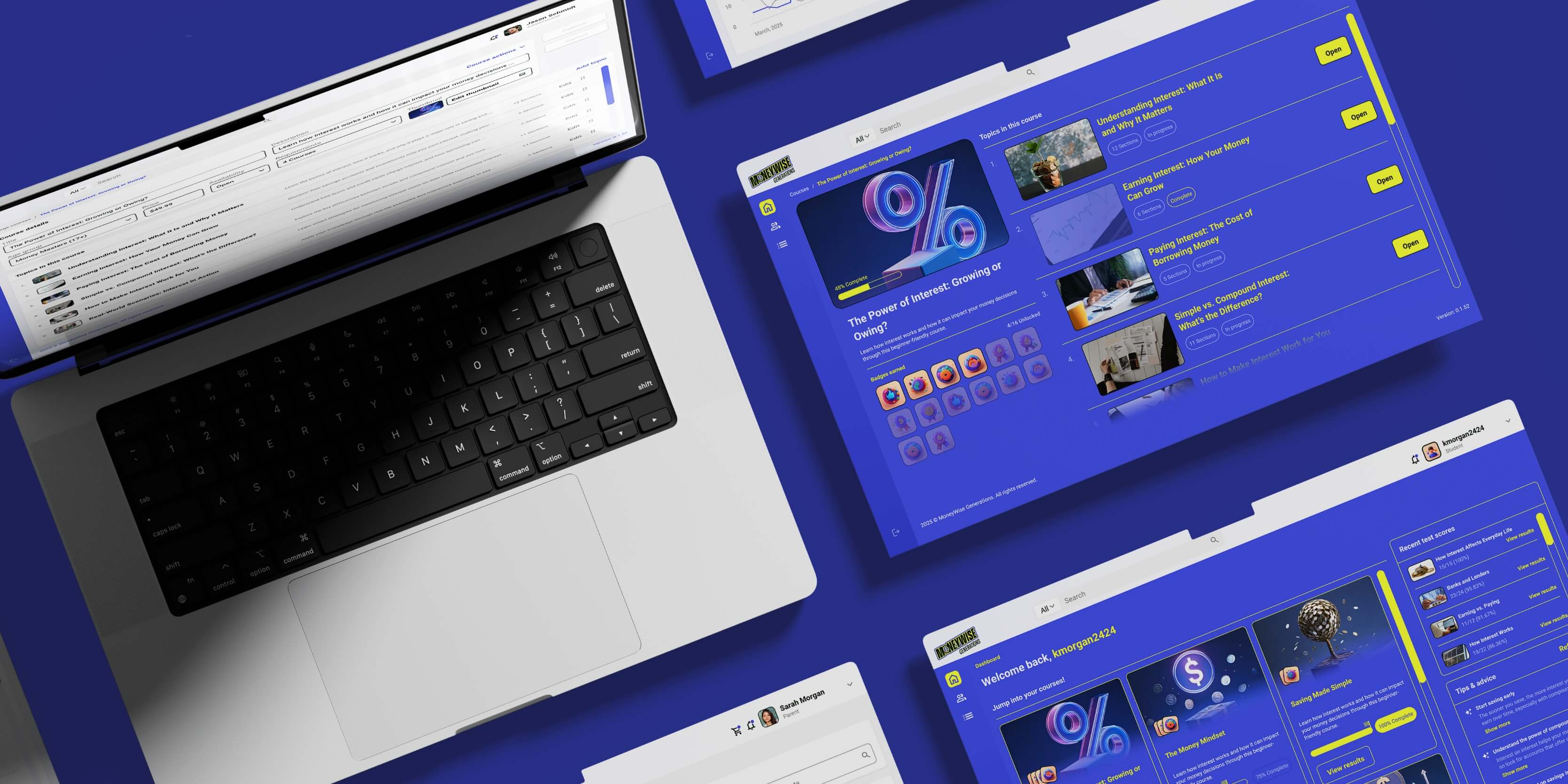
A design spectrum served as a tool to understand how and what design system tokens should be treated as variables between the two audiences.
The core innovation of the project was a design spectrum. I created a baseline UI
with neutral tokens—such as typography, spacing, and colour schemes—that could then be dialed up or down
depending on the audience.
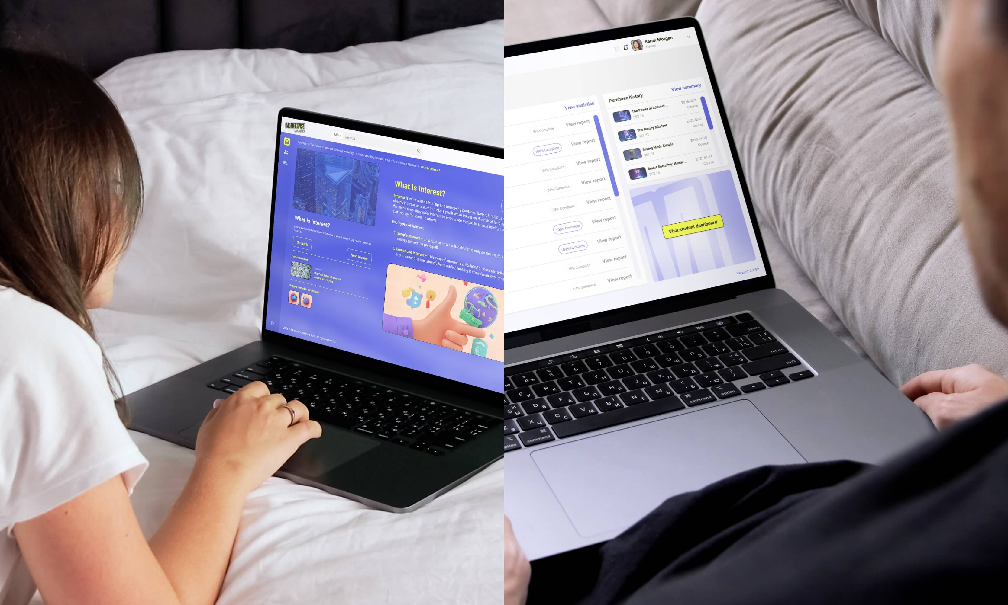
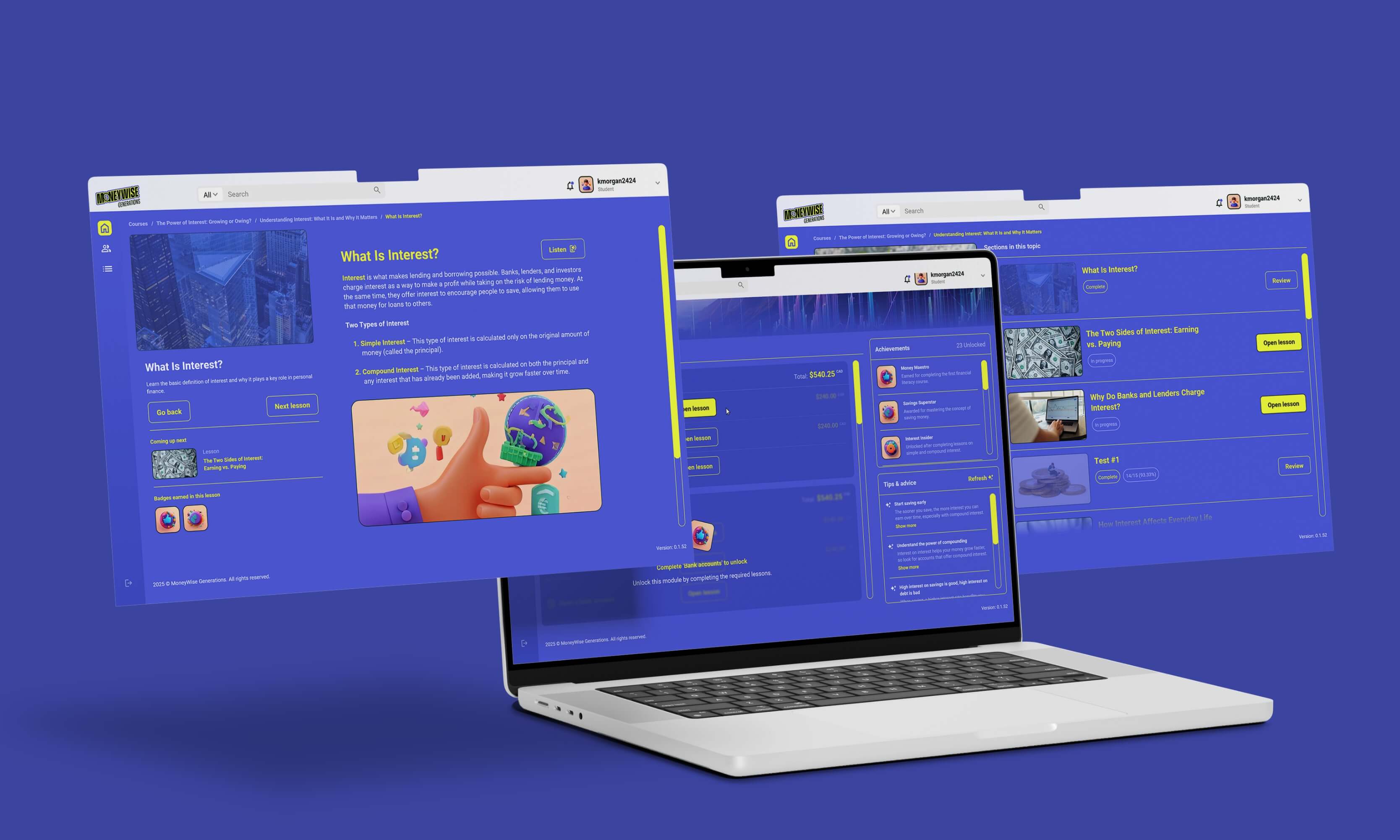
Younger users saw brighter palettes, animated elements, and imagery to keep
them engaged, while older users experienced a more streamlined and reserved interface. This approach
enabled us to balance two very different audience needs without fragmenting the overall product design.
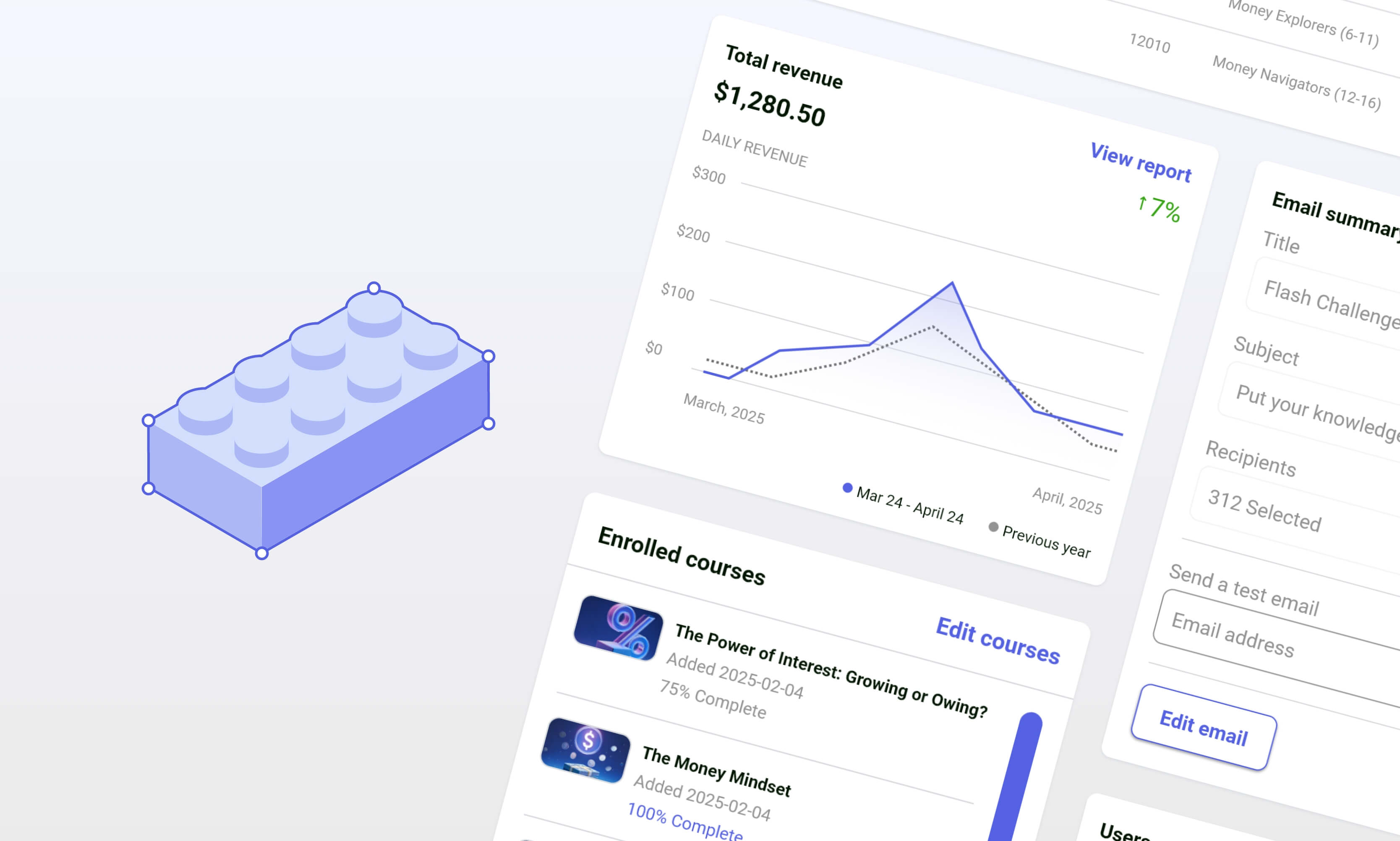
The base UI took inspiration from brands like Google and Shopify, offering a clean aesthetic that made data review relaxing.
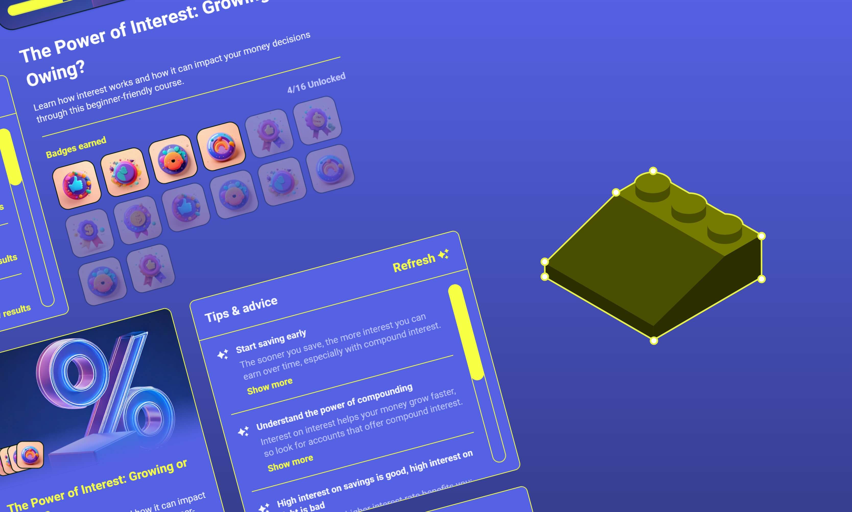
The 'youth' UI included more interactions, imagery, and colour to deliver a more energetic & engaging experience for younger users.
The design rubric for the base UI emphasized creating an experience that felt clean and simple for users.
Colour and interactivity served as the foundation for the youth theme of the UI.
Through iterative cycles of prototyping and evaluation, we delivered a robust design
system that scaled elegantly across user groups. From a production standpoint, the system streamlined
developer workflows by allowing components to be reused and easily adapted across different contexts.
For users, the outcome was an experience that felt equally polished whether they were a child engaging
with colourful learning modules or an administrator reviewing performance data. This project highlighted
how thoughtful design systems can unify diverse needs into a single, cohesive platform.