Great design isn’t just about how things look—it’s about how clearly they communicate. Visual design systems bring clarity and consistency to your work, helping you create polished experiences without reinventing the wheel every time.

Design systems are all about working together when determining how to organize ideas in a visual context.
Coming up with creative and effective ways to communicate using visual elements is one of the most important aspects of visual design. When done well, even complex information becomes easier to understand and more engaging for users.
But when working on large, complex design projects, it’s common for minor inconsistencies to creep in—like mismatched font sizes or uneven border weights. These inconsistencies can chip away at the quality and polish of the final product, while also making the file more difficult to work with.
A visual design system helps solve this by establishing a set of design rules that streamline decision-making and promote visual consistency. When done practically, these systems allow designers to focus on creativity without being bogged down by repetitive or conflicting choices.

A design system can include a variety of topics depending on what's needed © Shopify.
Inconsistent visual choices reduce the effectiveness and professionalism of a design. From typography to spacing, even subtle variations can make a design feel scattered or unfinished.
The challenge increases as projects grow in scope, evolve through review stages, or span multiple phases. Without a solid method for managing design consistency, maintaining quality over time becomes much harder.
That’s why it’s important to approach consistency with intention—using systems and strategies that support both quality and efficiency.

Users expect consistency, because the alternative is a chaotic experience of navigating oddly designed UI © Microsoft.
A good design system respects the designer’s time. It should improve efficiency and creativity—not limit it. If the system slows you down or makes your work feel rigid, it needs to be re-evaluated.
Most practical visual design systems include three foundational components: sizing, grids, and layers. Each one helps reduce guesswork and promote consistency across the entire design.
Once these foundations are in place, you can layer in additional rules or conventions based on your industry, team needs, or personal workflow preferences.

Guides and rules in this context serve as tools to help foster creativity, not stifle it © Apple.
Design files are filled with size decisions—font sizes, padding, margins, borders, and more. A base sizing value helps keep these elements scaled consistently. Many designers use a base of 4 or 8, applying this value across the entire design.
Using a base value makes decisions easier and improves visual alignment. For example, setting font sizes like 16px, 20px, and 24px (all divisible by 4) gives a predictable rhythm to the design. This approach can be extended to spacing, border-radius, and other properties.
Consider a paragraph font set at 16px. Using a base-4 system, the heading could be 24px, and button padding might be 12px. This gives the entire layout a cohesive, polished feel without overthinking every value.

Sizing elements accounts for most design decisions when building out a UI. Adding order and logic to sizing helps designers work more efficiently © Shopify.
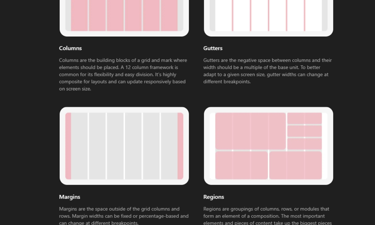
Grids provide a structure for content placement and alignment. They make it easier to manage width, spacing, and alignment across different sections of a layout.
A common grid system uses 12 columns, which divides easily into halves, thirds, and quarters. This makes it simple to create balanced layouts for multiple types of content.
If you're designing a product feature section, using a 12-column grid lets you snap three features into perfect alignment by giving each four columns. You could then use a full-width block below for a call-to-action that spans all 12 columns.
Grids are powerful, but they shouldn’t box in your creativity. Consider adding alignment variations or offset techniques to avoid overly rigid layouts while still maintaining consistency.
Grids are at the heart of an organized design © Microsoft.
Layers allow you to organize and manage your design files effectively. Grouping elements and using clear, consistent naming conventions helps both you and your collaborators navigate the design.
It’s especially important when working in teams or handing off designs to developers. Clean, well-labeled layers reduce confusion and help others understand your design intentions faster.
Instead of “Group 47,” try naming a button layer group “btn-primary” and its secondary variant “btn-secondary.” This removes guesswork when someone else picks up the file later on.
Avoid cryptic or overly complex acronyms. If your naming system requires a legend to decode, it’s probably too complicated.

Layer organization is like setting up a small library, where you're helping others find what they're looking for in the shortest time possible.
Sizing, grids, and layers are simple tools—but when used together, they form a powerful system that makes design more consistent, intuitive, and efficient.
Each decision becomes easier because the rules are already defined. You’ll spend less time making repetitive choices and more time exploring creative solutions that push the design forward.
If your system starts to feel clunky, simplify. A practical design system should be a creative companion, not a creative roadblock.

At the end of the day, design systems are tools meant to make the lives of ourselves and our colleagues easier.
Designers don’t work in a vacuum. Projects are often passed between teams and disciplines—especially in digital environments like websites and apps. A good visual design system improves communication and handoffs.
Developers in particular appreciate when designers use consistent values, grids, and well-organized layers. It reduces the need for clarification and lets them move forward confidently with implementation.
Imagine handing off a clean, well-structured file to your dev team. With clear grids, consistent sizing, and well-labeled buttons and elements, they can begin development with minimal friction.
A practical visual design system is more than just a tool for consistency—it’s a way to build better relationships between the people involved in bringing a design to life.